
How Polarized Is America Really?
Evidence for increasing polarization from the voting record of the United States Congress
The first presidential debate of 2020 seemed to reach a new low. The internet was awash with think pieces about just how contemptuous the relationship between the candidates seemed, with most people convinced that the clash between Joe Biden and Donald Trump was even dirtier than past debates. The same could have been said in 2016, comparing the debates between Hillary Clinton and Donald Trump in that year to debates prior. Is it only a coincidence that these debates get ever more heated over the years, or is this actually the product of a growing polarization in the country?
In his best-selling book “Why We’re Polarized”, Ezra Klein describes how the polarization in America came to reach its current fever pitch. America, and arguably the entire world, is getting more polarized year over year. Quoting from the book, “…when Gerald Ford ran against Jimmy Carter, only 54 percent of the electorate believed the Republican Party was conservative than the Democratic Party. Almost 30 percent said there was no ideological difference at all between the two parties”- a statement which would be unthinkable to describe today’s politics.
Klein’s book inspired us to dig deeper into the numbers and see if just how bad the polarization problem is. But how could we quantify polarization? One way would be to look at how America’s elected politicians voted in Congress. As Klein’s book mentioned, in an un-polarized system, there is not such a strong ideological divide between members of each party. In terms of voting, this means that members of each party would be more likely to cross party lines when voting on certain issues. In a more polarized system, members would be much more likely to vote only inline with their party.
We thus decided to look at the voting positions of members of both parties over the past 30 years. Every vote the House and the Senate take are publicly available online (here), in the format shown below.
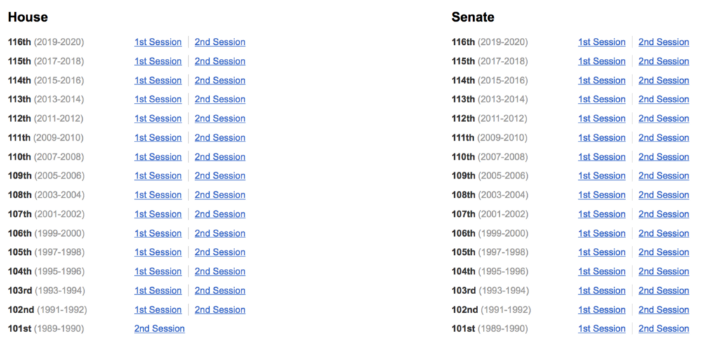
About the Congress
To understand this data, we must first understand the US legislative system.
The U.S. has a bi-cameral legislature, meaning there are 2 houses that make up the legislative branch. The legislature is called Congress. The two houses (also called chambers) comprising the Congress are the House of Representatives (lower house), and Senate (upper house). The House of Representatives (often shortened to just “the House”) is based on population. There are 435 total Representatives (also called Congresswomen or Congressmen), and each state receives a different number of Representatives depending on their state population. For example, California, with a state population of 39.5 million, has 53 representatives, whereas Nebraska with its population of 1.9 million has 3. The number of representatives assigned to each state is updated every 10 years, after the US census is completed. This is why the census in America is highly politicized. Each Representative in the House serves for 2 years. This means that the entire House has the possibility to be renewed every 2 years.
The Senate works differently — each state receives 2 Senators, regardless of its population. Since the US has 50 states, there are 100 Senators in total. Senators serve 6-year terms, meaning that every 2 years, 1/3 of the total Senate has the possibility to be renewed.
Both houses of Congress can propose bills. Bills then receive an ID number. If the bill was proposed by the House, its number will start with “H.R.”. If it was proposed by the Senate, its number will start with “S”. The chamber which proposed the bill will vote on it first, but to become law, both chambers must vote on the bill. Bills are then signed into law (or vetoed) by the President.
Now that we have some background about the two chambers of Congress, we can take a closer look at the outcome statistics of one House and Senate vote, respectively.
Data
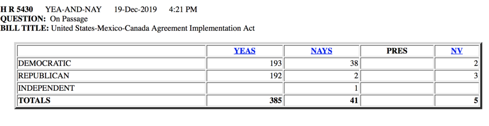
The image below shows one example of the result of a vote in the House. From the header we can see in which year the vote was held and which bill was voted on. Our data also includes a table showing how members of each party voted on the measure.
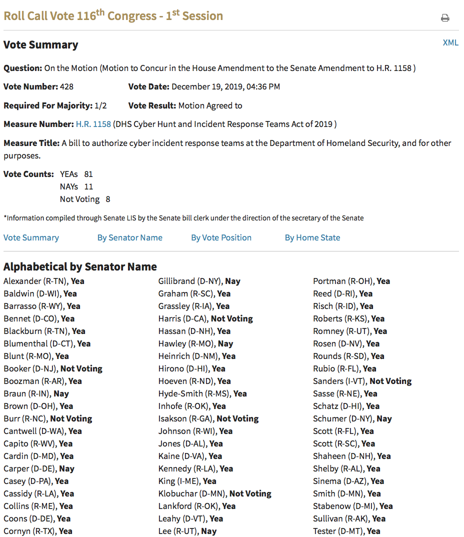
For the Senate, the data we have about each vote is more detailed. In order to find out how many Democrats or Republicans voted with either “Yea” or “Nay”, we have to extract that information from the Senator-specific table which is given below.
We used web scraping to extract and save the data for each vote in the House and Senate. The Python script for this webscraping can be found in the github repository for this project.
Empirical Evidence
After scraping all decisions of the Senate and House between 1989 and 2020, it is time to look at some visualizations to better understand our data. First, we look at how many people of each party held seats, on average, in the House and Senate. This is done by averaging the data over the years and grouping by party (Democratic or Republican) and type (House or Senate).
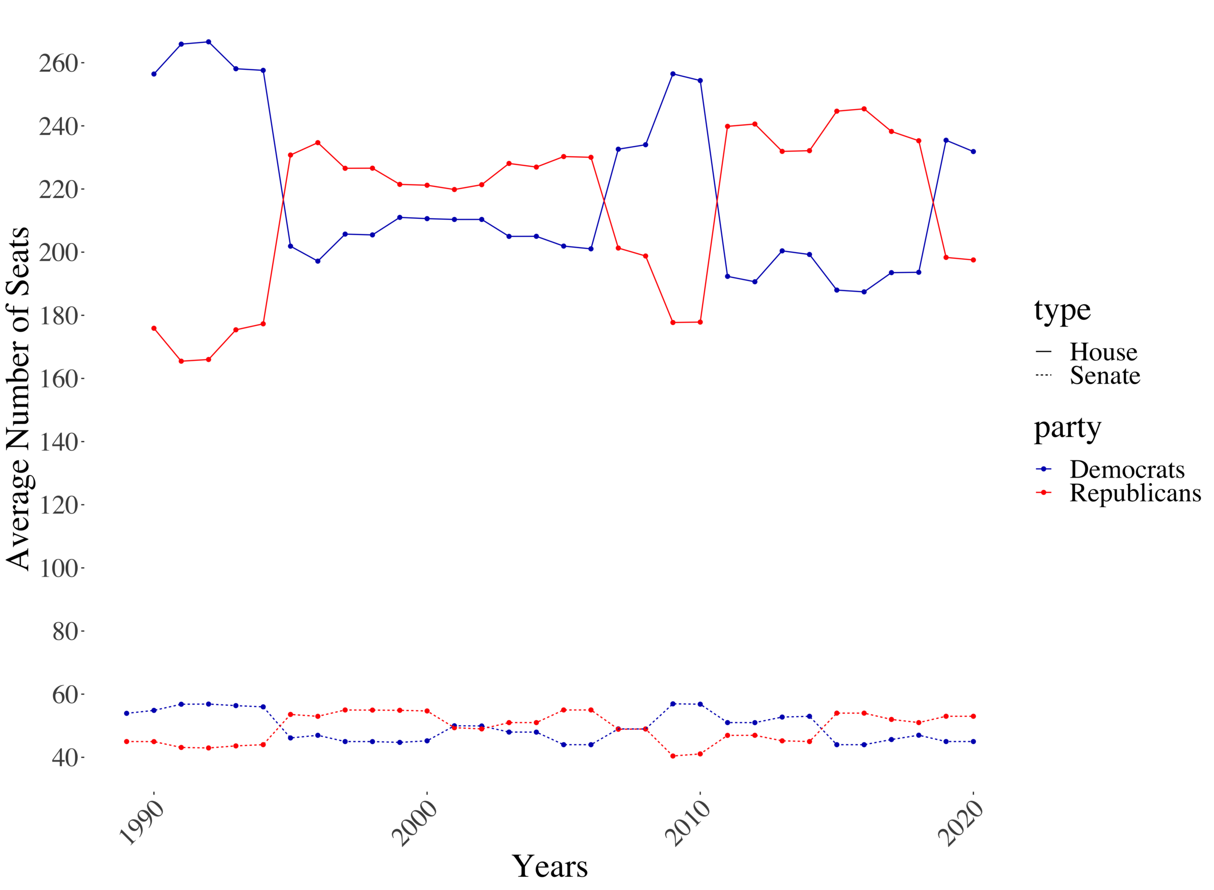
This image nicely shows how the majority in the House and Senate changes over time. We can see a general correlation between the majoirty party in both chambers — when the House is controlled by Republicans, generally the Senate is as well. Given that the entire House is replaced every second year, compared to only 1/3 of the Senate, it is logical that we see a drastically higher fluctuation over time. Given the fact that is replacing the Senate simply takes significantly longer than to replace the House, we can also see that after one party gained the majority in the House, the corresponding switch in majority in the Senate trails behind, switching a couple of years afterwards.
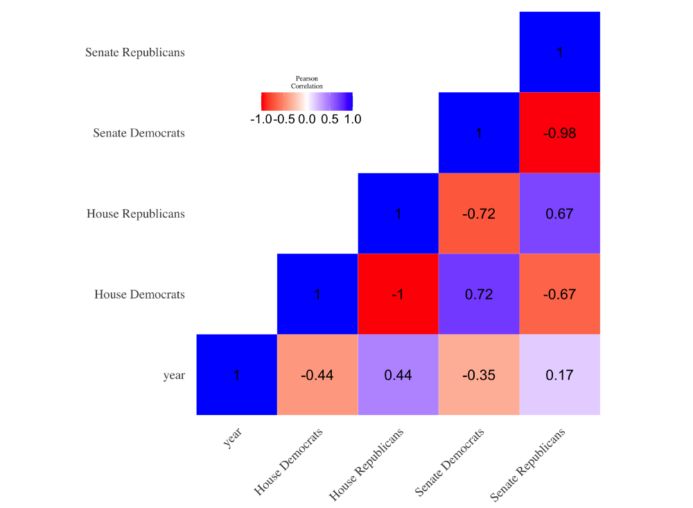
This correlation between the House and Senate is also visible when looking at the correlation matrix below. Here we can see majority in the House and Senate are strongly positively correlated with a value of 0.72 for the democratic and 0.67 for the republican party.
Especially interesting is the last row of the correlation matrix. Here we can see that between 1989 and 2020, we see on average an increase in the number of seats for the republicans in the Senate as well as House. Given that the Senate and House have a fixed number of seats, we find a negative correlation between Year and the number of seats for democrats.
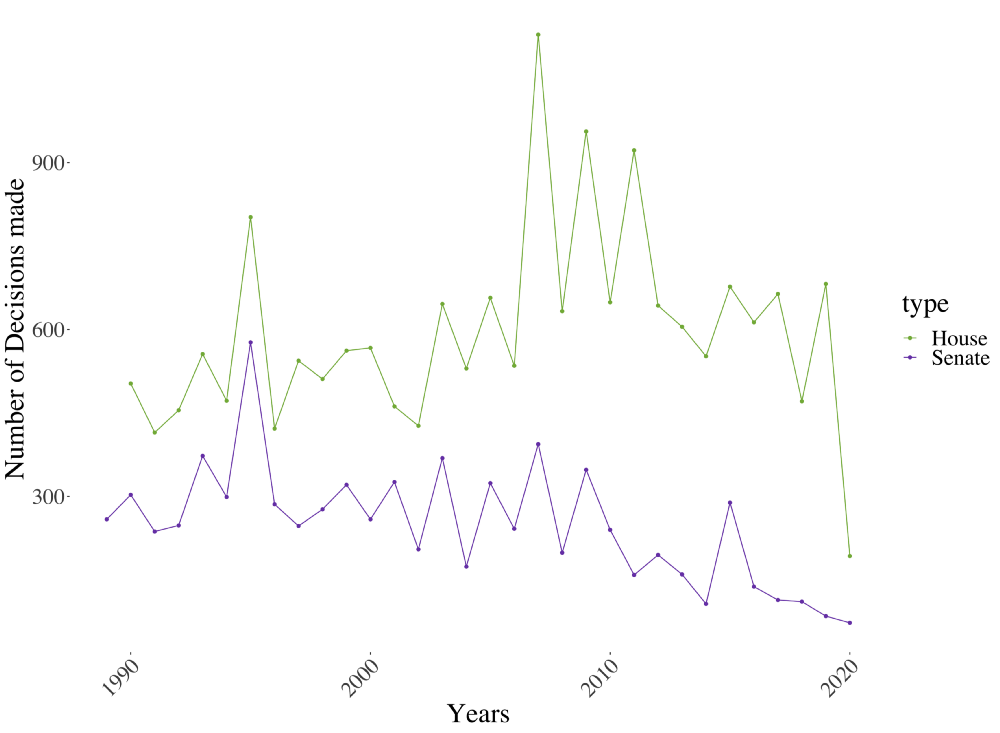
Another interesting figure to look at is the number of decisions made in the House as well as the Senate over time. This number is calculated by a simple count of votes for every year between 1989 and 2020. From the chart below we can see that the House voted on a higher number of decisions, compared to the Senate. Furthermore, we can see that both lines seem highly correlated over time. This is sensible given that much legislation has to go through both the Senate as well as the House in order to be passed.
The concept of Polarization
After covering some summary statistics of the data and US legislature, we shift to focus on the polarization within American politics. It is first crucial how we define as polarization. In order to create a better understanding of that term, we will paraphrase some parts from the aforementioned, well-researched book from Ezra Klein:
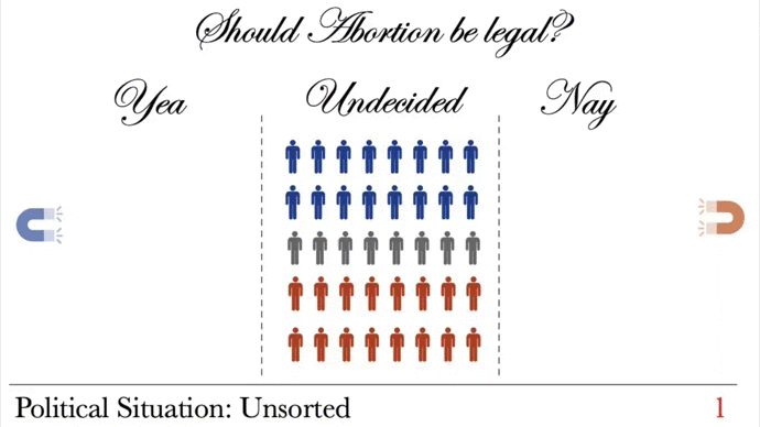
There is a long-running debate whether what we witness in American politics is actually polarization or “only” sorting. In order to explain the difference we take the example of abortion and assume 100 randomly drawn people. Forty people would like to ban abortion, another forty would like to make it legal and the missing twenty have not made up their mind yet.
Let us now assume that all people who are in favor of the right to get an abortion join the Democratic Party and the ones who are not in favor join the Republican Party, and the undecided voters join evenly both parties. In this case, we would say that the beliefs are perfectly sorted by party. It is important to note that nobody changed his or her opinion compared to the point before when nobody joined a party.
In order to show what polarization is, we change the example a bit. We now say there are no more undecided voters and that we now have fifty people on each side of the spectrum. The elimination of the middle ground and the clustering around the opposite political poles of an issue is called polarization. </em>
That means that as the party puts more focus on certain policy issues, it becomes harder and harder for people to stay undecided. The influence of the political parties and its members make the standpoints of the opposite parties even more distant from one another.
Furthermore, the interaction between the ever-growing distance between the two standpoints and the resulting political division between people is a self-reinforcing one. People who joined the Democratic Party given their pro-choice beliefs expect to be represented accordingly by the Party. This push by its members to fight for these issues makes the position of the Democratic Party even more contrasting to the views of the Republican Party. This polarization process will then result in a decreasing number of undecided voters over time.
The concept of polarization is further visualized in the GIF below. Note the image number at the bottom right of each image, we will use these to describe what’s happening in each polarization phase.
The first picture (1) shows a case where we have an unsorted nation — people with certain beliefs are not part of any of the two available sides of the problem. The second picture (2) shows the phenomena of sorting. All people are now on either the Republican or Democratic side. We still have a couple of undecided voters who do not have a strong opinion regarding the topic of abortion. The third picture (3) is then the crucial one. The reinforcing effect of the stronger party focus on the issue increases the contrast between the two parties to an such an extent that it is hardly possible to stay undecided. Like a magnet that grows stronger over time, undecided voters are pulled to either side.
Empirical Measurement of Polarization
After covering what we mean when we talk about polarization, it is now the time to define it mathematically, in order to quantify it.
Measuring polarization means simply assessing how strong the clustering is around certain political issues. If the clustering is strong, we would assume that the disagreement between the Democratic and Republican parties is high. When having a vote, clustering would mean that the absolute difference between the relative amount of Democrats who said yes (no) to the relative amount of Republican who said yes (no). Given that rationale, we define empirical polarization as the following:
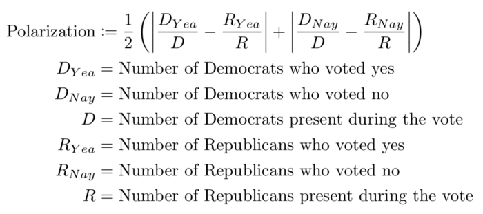
The reason for taking the average of the absolute relative difference of the Yeas and Nays, instead of simply taking either one of them, is to account for the special case of having non-voters.
We are now able to quantify how high the polarization was for every single vote held in the Senate and House. Next, we average the resulting polarization numbers for each vote on a yearly basis, separating for House and Senate. The graph below show the result of these steps.
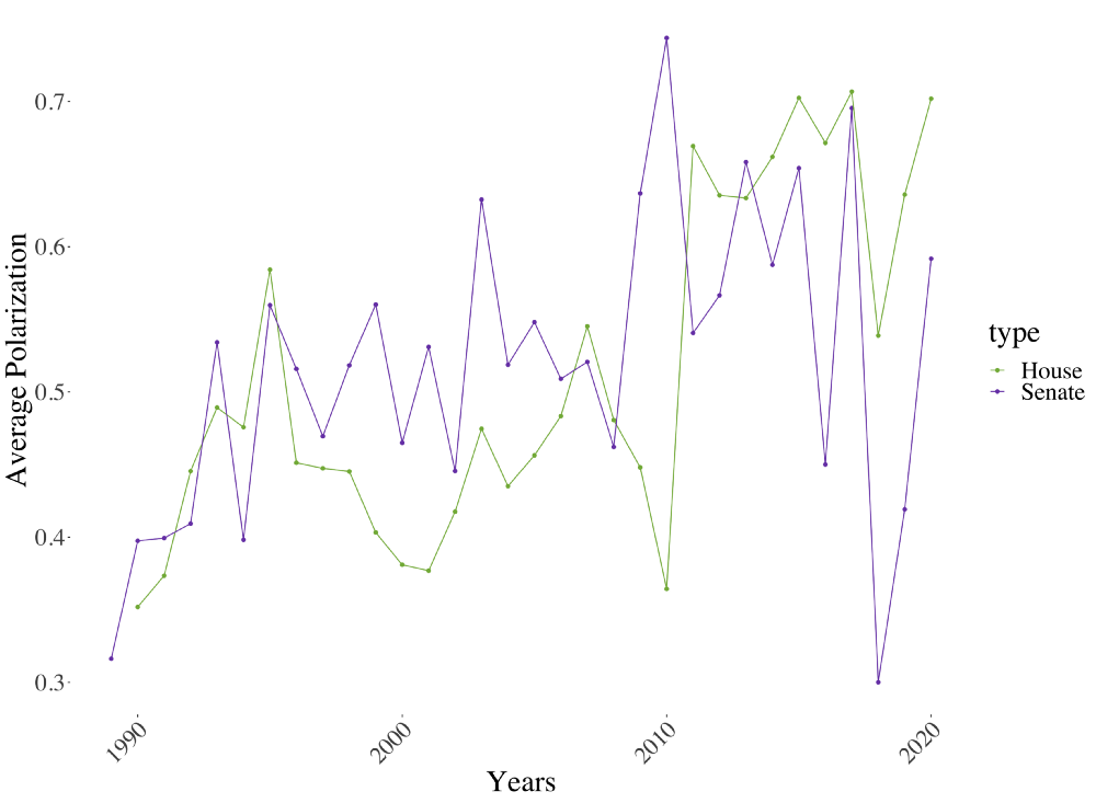
From the graph above it looks like the overall polarization increased over time. Since we do not want only trust our eyesight, we also fit a linear regression line through the observations. The resulting line and summary statistics are visible below.
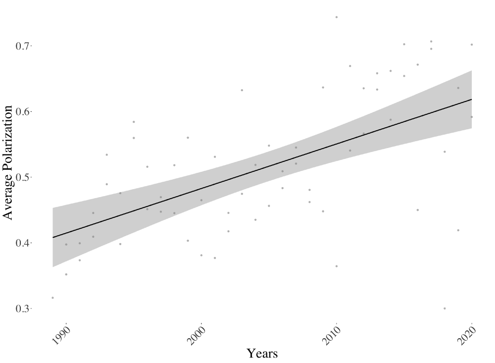
The resulting line above strengthens our belief of the positive relationship between year and average polarization. Looking at the summary statistics below confirms that this positive linear relationship is also significant. The coefficient is to be interpret the following way: holding all else constant, the influence of increasing the year by one changes the average polarization score by 0.00679.
That the effect is significant can be seen from the p-value. The p-value tells you how likely it would be to find such a test result, or an even more extreme one, assuming the null hypothesis is correct. The null hypothesis when testing a beta coefficient within a linear regression is that the true value of beta is equal to zero.
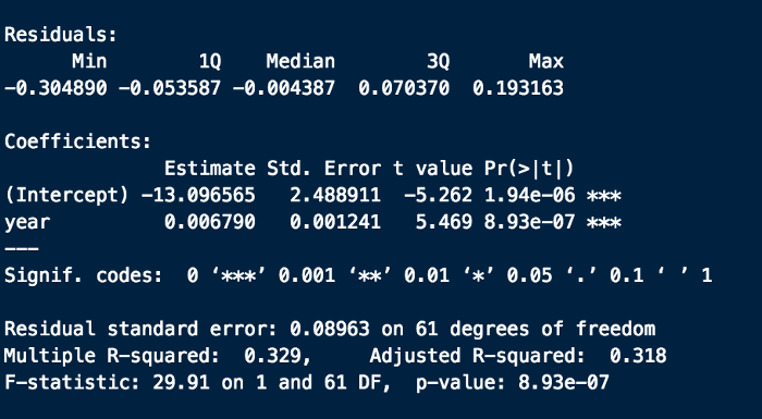
From the regression above we learned that the average polarization increases by approximately half a percentage point every year. This might seem insignificant on first glance, but when putting this number into perspective, we see that long-lasting implications of it. If the average polarization value was around 40% in 1990, the coefficient of 0.00679 would imply an increase average polarization of 0.00679 * 30 years = 0.2037. An increase of 20 percentage points! This increase is mindblowing and truly shows the direction of american politics and reflects the mindset of the people.
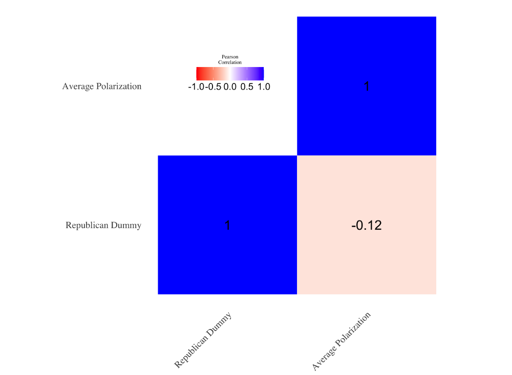
Lastly, given that we could see from the graph before that the average polarization did not increase linearly but actually more in a step-function, we test whether these increases are related to a change in the party holding the majority in each chamber. In the graph below we colored the background according to the majority in the given chamber.

On first glance it does not seem that which party has the majority has any effect on the average polarization. In order to also quantify this hypothesis we measured the correlation between who has the majority (Republicans encoded as 1 and Democrats as 0) and the average polarization. From the image below we see our initial judgement of the graph above validated. With a relatively small correlation of 0.12, it does not empirically show that who has the majority of either the House and Senate has any effect on the increase of the average polarization.
Assessing Party Unity
After assessing the average polarization over the years, it would be interesting to assess the respective party unity. A higher value of polarization might imply a higher value of party unity, though, we do not know which party, if not both, developed a stronger standpoint on a topic.
For that reason we also now define mathematically what we mean with party unity:
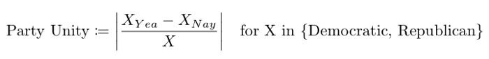
The formula above has a maximum of one, for the case where the all Representatives or Senators of a party unanimously vote either yes or no. The minimum of the function is zero, when we have exactly half of the party votes yes and the other half votes against it.
After calculating the party unity for all votes we have in our data, we then average the unity over the years. The resulting data and fitted regression lines for the House and Senate are shown in the image below.
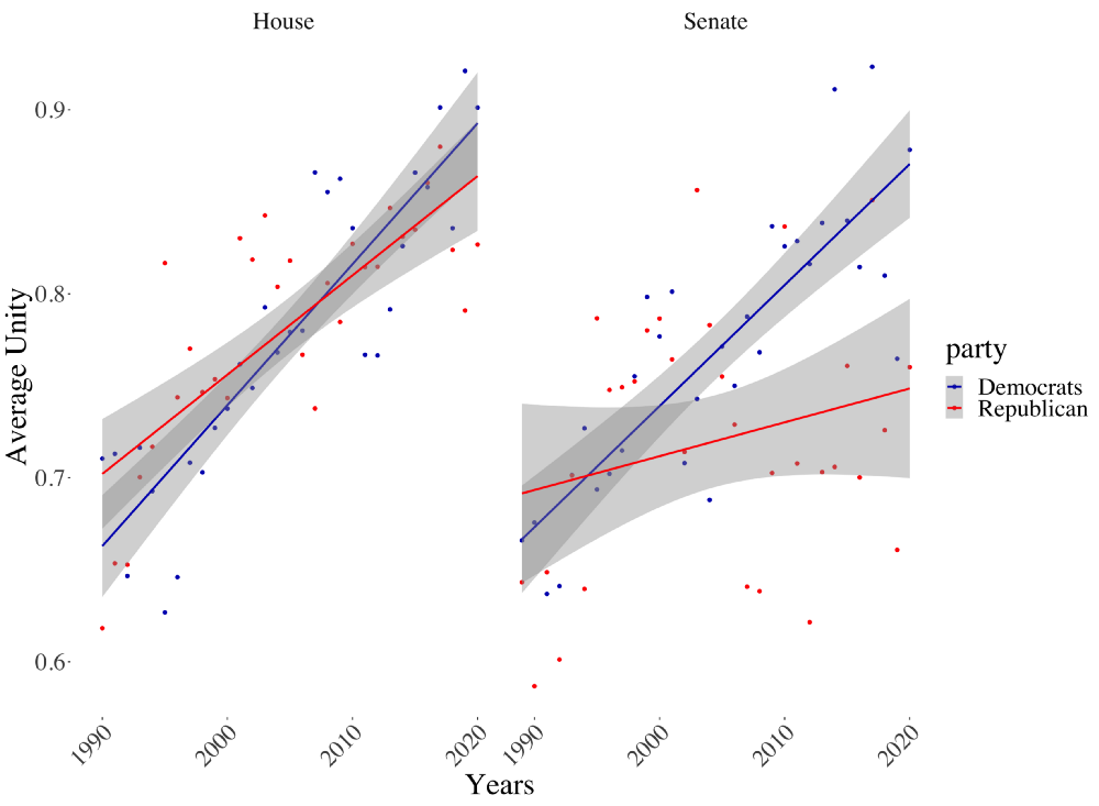
Given that we already established a significant trend of polarization within the Congress, it is no surprise to find positive trend lines. Overall, it looks like the House has a stronger party unity compared to the Senate for both parties. This fact could be explained by the fact that the entire House is replaced every two years, and therefore that chamber is more susceptile to increasing polarization of public opinion. The Senate, on the other hand, changes only 1/3 of its members every two years and thus is less affected by these fluctuations.
Another interesting note is that for both chambers we see a higher level of party unity for the Democratic party. Especially for the Senate the difference in the slope coefficient becomes apparent. That said, it’s also important to note that the intercept for the Republican party is higher for both chambers. Combined with the somewhat smaller slope, that means that Republicans used to be more united than the Democrats, but lost that top-spot to the Democrats over the years.
Conclusion
Statistics can help us verify our gut feelings on a given topic. In this article, we were able to empirically prove what many observers of American politics have long felt — that our country is becoming more divided. By defining equations for both polarization and party unity, we were also able to quantify the extent to which these effects are worsening.
Now that we know polarization really is a problem that’s getting worse over time, the next logical question is what we can do to stymie it. In “Why We’re Polarized”, Klein’s advice to readers is to move their politics and hopes for the issues that matter to them from the national to the local level. By engaging in local politics and community engagement, we engage directly with issues on the ground, which helps take the focus on these issues away from the parties themselves. This helps break the self-reinforcing cycle where policy polarization feeds political polarization. Other solutions are more structural and involve re-wiring our political system to better serve the needs of the country today. Klein also mentions that institutions that block the will of the people from being heard, such as the Electoral College, further fuel polarization and should be eliminated.
It’s clear that we must take look for both cultural and structural solutions to the problem of polarization if we want to see civility brought back to our politics, and their biggest stage, our presidential debates.