
Markowitz Portfolio Theory - An empirical explanation
Building and simulating different stock portfolio and assessing risk and return with Python and R Shiny Link to App
Building a portfolio is easier said than done. The sheer amount of combination possibilities is overwhelming. Furthermore, it is oftentimes not completely clear what a certain stock combination will do to the portfolio return and risk. This blog-post clarifies how to determine the portfolio risk and return by showing a two-asset example before moving on to the general n-asset example.
Before starting, we declare the needed packages in Python as well as the directories we are going to need. Furthermore we import the a function which creates financial return data by inputting the
# Packages
import os
import numpy as np
import pandas as pd
import matplotlib.pyplot as plt
from tqdm import tqdm
import quandl
import datetime as dt
import scipy.optimize as solver
# Paths
main_path = r"/Users/user/Documents/projects/markowitz"
raw_path = r"{}/00 Raw".format(main_path)
code_path = r"{}/01 Code".format(main_path)
data_path = r"{}/02 Data".format(main_path)
output_path = r"{}/03 Output".format(main_path)
Portfolios of Two Risky Assets
When having a multi-asset portfolio there are not many levers we can pull to alter the portfolio’s return and variance. The average return, the risk (standard deviation) of a financial asset as well as the correlation between the two assets is fixed. The only thing we have influence over is how much weight we put on each asset. That means we have to ask ourselves how we should split our capital on the acquisition of both assets, how much of each asset we should buy.
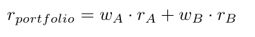
As an example we take the stocks, Apple Inc. (abbreviated as A) and Bank of America (abbreviated as B). Furthermore we denote w as the weight of a respective stock and r and σ as the return and standard deviation respectively. The return of the portfolio containing these two stocks is then calculated as the simple weighted average of theses stocks
The portfolio variance is denoted as sum of the covariance matrix of these two stocks. This becomes clear when looking at the formula below in addition to the covariance matrix.
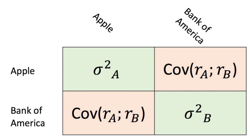

Note that the variances are not multiplied by their weight as is, but by their quadratic weight. This happens because the variance is simply the covariance with itself.
Now we would like to see what kind of risk and returns are attainable for different weights. For that start by loading in the time-series returns for both stocks. We do that by using the powerful pandas_datareader package and the yahoo finance API.
starting_date = "1/1/2010"
ending_date = "1/1/2020"
stock_tickers = ["AAPL", "BAC"]
# Pull the chosen tickers
df_prices = pd.DataFrame()
for ticker in stock_tickers:
    try:
        tmp = web.DataReader(ticker, "yahoo",
                             starting_date,
                             ending_date)
        df_prices.loc[:, ticker] = tmp['Adj Close']
    except KeyError:
        pass
    except RemoteDataError:
        print("Returns for these dates not available")
        pass
returns = np.log(df_prices / df_prices.shift(1)) * 252
# Renaming columns
ticker_names = list(returns.columns)
actual_names = ["Apple", "Bank of America"]
renaming_dict = {i: j for i, j in zip(ticker_names, actual_names)}
returns.rename(columns=renaming_dict, inplace=True)
From the code above we see that we cannot simply use the original company names “Apple” and “Bank of America”, but something called a stock ticker. A stock-ticker is a three to four letter abbreviation of a company’s name. Furthermore, we have to define for which time-frame we would like to load the data. In our example we arbitrarily pick the beginning of 2010 and 2020 as the starting and end date respectively.
In order to show annualized returns, we multiply the returns by the number of trading days per year. The next step is now to simulate the return and risk of our two stock portfolio for all kind of weighting possibilities. For that we define a function which returns us the portfolio return and risk for a given level of granularity and, as will be explained a bit later, the correlation between the two assets.
def two_stock_portfolio(reshaped_returns, granularity, rho):
    """
    This function calculates all the risk and expected return for
    all possible weight combinations for two stocks. It returns
    two lists which contain the risk level and expected return
    for all portfolio combination. The granularity adjusts
    how many portfolios are calculated.
Parameters
    ----------
    reshaped_returns : dataframe
        DataFrame which contains exactly two time series with
        the two stocks returns
    granularity : int
        Determines for how many portfolios we calculate the
        risk and return
    rho : float
        Depicts the correlation which is important for calculating
        the portfolios risk
Returns
    -------
    list_return : list
        List with all portfolio returns
    list_std : list
        List with all portfolio standard deviations
"""
share_names = list(reshaped_returns.columns)
    weights = np.linspace(0, 1, num=granularity)
exp_returns = np.mean(reshaped_returns)
    std_returns = np.std(reshaped_returns)
list_return, list_std = [], []
    for weight in weights:
        portfolio_return = (weight
                            * exp_returns[share_names[0]]
                            + (1-weight)
                            * exp_returns[share_names[1]])
        portfolio_var = (weight**2 * std_returns[share_names[0]]**2
                         + (1-weight)**2
                         * std_returns[share_names[1]]**2
                         + (2*weight*(1-weight) *
                            std_returns[share_names[0]]
                            * std_returns[share_names[1]]
                            * rho))
        portfolio_std = portfolio_var ** (1/2)
        list_return.append(portfolio_return)
        list_std.append(portfolio_std)
return list_return, list_std
The granularity depicts how many portfolios we would like to simulate, that means how many different weights should be used to calculate return and risk of a portfolio.
The long formulas for the variables portfolio_return and portfolio_var are nothing other than the two formulas shown earlier in this post. After initializing the function we call it and plot the results through the following snippet of code.
exp_returns = np.mean(returns)
risk_level = np.std(returns)
rho = returns.corr().loc[actual_names[0], actual_names[1]]
granularity = 1_000
list_returns, list_std = two_stock_portfolio(returns,
                                             granularity, rho)
fig, axs = plt.subplots(nrows=1, ncols=1, figsize=(10, 10))
axs.plot(list_std, list_returns, label="Possible Portfolios", color="black")
axs.scatter(risk_level[0], exp_returns[0], label=actual_names[0],
            color="turquoise", s=200)
axs.scatter(risk_level[1], exp_returns[1], label=actual_names[1],
            color="blueviolet", s=200)
axs.legend(fontsize=18)
axs.set_ylabel("Annualized Expected Return", fontsize=18)
axs.set_xlabel("Annualized Risk", fontsize=18)
axs.set_title("All possible Portfolios", {"fontsize": 18})
axs.tick_params(axis="both", labelsize=16)
fig.savefig("{}/markowitz_basic.png".format(output_path),
            bbox_inches="tight")
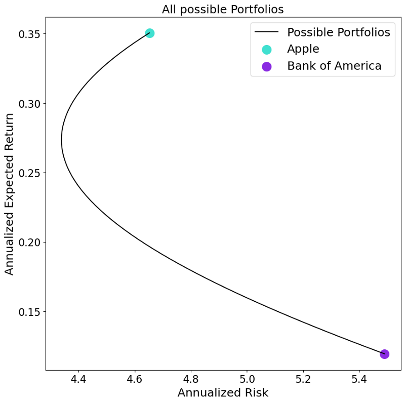
The resulting portfolio possibilities give us several interesting insights. Firstly, as expected, the two possible extreme portfolio weighting are a 100% allocation of one of the two assets. Secondly, we see that there are possible portfolios with which we can reduce the overall risk level compared to when holding only one of the two stocks. Thirdly, we find there are some portfolios which are superior to others. Considering the portfolio closer to the Apple stock, we see for the same level of risk we could have create a portfolio with more or less return.
The second finding also explains the aforementioned importance of the correlation between the two assets. This is because the two company’s returns are driven by slightly different factors. Imagine a portfolio with two companies, one company producing swimming trunks and the other producing umbrellas. This portfolio is nicely hedged given that if the weather is sunny the returns of the swimming-trunks company are high while the umbrella company’s return are low. Exactly the reverse is true on a day with bad weather. Looking at the correlation of the returns of these two time-series we find a less-than-perfectly-positive correlation. This fact allows the investor to dampen negative returns of one company through higher returns of another company within their portfolio. How high this risk reduction is depends on the correlation of these two financial returns.
The dependence on the correlation is also nicely visible when altering it. Let us see how the plot from above would look like if we alter the correlation to a perfectly negative correlation (-1) and a perfectly positive correlation (+1). This is done through the following code.
potential_correlation = {
    "Perfect Negative Correlation": -1,
    "Actual Correlation": rho,
    "Perfect Positive Correlation": +1
    }
fig, axs = plt.subplots(nrows=1, ncols=1, figsize=(10, 10))
for name, rho in potential_correlation.items():
    list_returns, list_std = two_stock_portfolio(returns,
                                                 granularity, rho)
    axs.plot(list_std, list_returns, label=name)
axs.scatter(risk_level[0], exp_returns[0], label=actual_names[0],
            color="turquoise", s=200)
axs.scatter(risk_level[1], exp_returns[1], label=actual_names[1],
            color="blueviolet", s=200)
axs.legend(fontsize=18)
axs.set_ylabel("Annualized Expected Return", fontsize=18)
axs.set_xlabel("Annualized Risk", fontsize=18)
axs.set_title("The influence of correlation on the portfolio possibilities",
              {"fontsize": 18})
axs.tick_params(axis="both", labelsize=16)
fig.savefig("{}/markowitz_correlation.png".format(output_path),
            bbox_inches="tight")
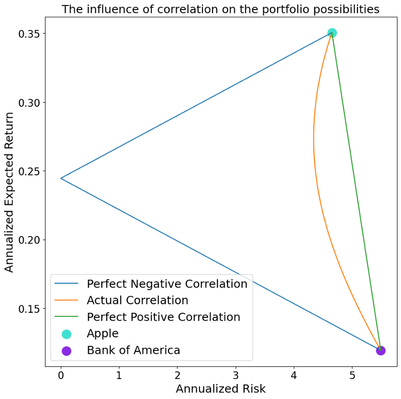
Very interestingly, we can see that in case we have a perfect positive correlation, we do not have any risk reduction effect, whereas we are able to create a completely risk-less portfolio when having a perfectly negative correlation.
Multiple Asset Case
After gaining some intuition as to how a portfolio return and risk is calculated, we are now ready to take a look what happens to multi-asset portfolio.
In general it can be said that not much changes. The return of a multi-asset portfolio is still denoted as the weighted average of the individual stock returns. Also, the risk of a multi-asset stock portfolio is calculated by summing up the weighted covariance matrix. The two formulas from above change therefore into the more general form of:
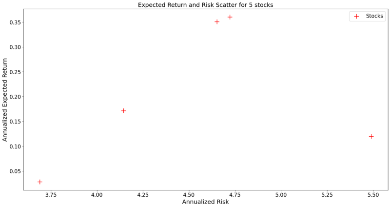
In order to show what happens empirically, we select five arbitrary stocks (Apple, Bank of America, Amazon, AT&T and Google) and plot their return and risk level by using the following code snippet
starting_date = "1/1/2010"
ending_date = "1/1/2020"
stock_tickers = ["AAPL", "BAC", "AMZN", "T", "GOOG"]
# Pull the chosen tickers
df_prices = pd.DataFrame()
for ticker in stock_tickers:
    try:
        tmp = web.DataReader(ticker, "yahoo",
                             starting_date,
                             ending_date)
        df_prices.loc[:, ticker] = tmp['Adj Close']
    except KeyError:
        pass
    except RemoteDataError:
        print("Returns for these dates not available")
        pass
returns = np.log(df_prices / df_prices.shift(1)) * 252
exp_return = np.mean(returns)
risk_level = np.std(returns)
fig, axs = plt.subplots(nrows=1, ncols=1, figsize=(20, 10))
axs.scatter(risk_level, exp_return, color="red", marker="+", s=200,
            label="Stocks")
axs.set_ylabel("Annualized Expected Return", fontsize=18)
axs.set_xlabel("Annualized Risk", fontsize=18)
axs.set_title("Expected Return and Risk Scatter for 5 stocks",
              {"fontsize": 18})
axs.legend(fontsize=16)
axs.tick_params(axis="both", labelsize=16)
fig.savefig("{}/unrestricted_markowitz.png".format(output_path),
            bbox_inches="tight")
As done before we will now simulated possible portfolios. This is done by creating 1,000,000 randomly generated n-column long weight vectors which are then used to simulate many potentially possible portfolios.
vector_returns = returns.mean().fillna(0)
covariance_matrix = returns.cov().fillna(0)
num_of_companies = len(returns.columns)
number_of_weights = 1_000_000
random_weights = np.random.dirichlet(np.ones(num_of_companies),
                                     size=number_of_weights)
weight_times_covariance = np.matmul(random_weights, covariance_matrix.values)
weights_transpose = random_weights.T
portfolio_returns = np.matmul(random_weights, vector_returns.T)
portfolio_std = []
for i in tqdm(range(number_of_weights)):
    row = weight_times_covariance[i, :]
    col = weights_transpose[:, i]
    diagonal_element = np.dot(row, col)
    element_std = np.sqrt(diagonal_element)
    portfolio_std.append(element_std)
fig, axs = plt.subplots(nrows=1, ncols=1, figsize=(20, 10))
axs.scatter(portfolio_std, portfolio_returns, color="dodgerblue", alpha=0.5,
            label="Possible Portfolios")
axs.scatter(np.sqrt(np.diag(covariance_matrix)), vector_returns, color="red",
            label="Stocks", marker="+", s=200)
axs.tick_params(axis="both", labelsize=16)
axs.set_ylabel("Annualized Expected Return", fontsize=18)
axs.set_xlabel("Annualized Risk", fontsize=18)
axs.set_title("Markowitz Mu-Sigma Diagram", {"fontsize": 18})
axs.legend(fontsize=16)
axs.tick_params(axis="both", labelsize=16)
fig.savefig("{}/n_asset_portfolios.png".format(output_path),
            bbox_inches="tight")
We see that this result looks significantly different to the two-asset case before. Firstly, instead of being all on one line, we now have some sort of an area of possible portfolios. Furthermore, when looking at the left side of these portfolios, it looks like there is some sort of a boundary as we already found in the two-asset case. This boundary is denoted as the asset frontier. It depicts all portfolios which have the minimal risk possible for every given level of return, while not allocating more than 100% of the capital available. This minimization problem has the following formal mathematical notation.
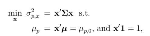
As an investor, we are, of course, interested in finding the lowest possible risk for a given return. Therefore finding the portfolio weights which solve the equation above, are of great interest to us. Through the scipy package in Python it is possible to calculate this minimization problem. A nice tutorial on how to use the scipy.minimize is found here.
Through the following code we calculate the desired frontier line and plot it additional to our simulated portfolios.
def objective_function(w):
    return np.sqrt(np.linalg.multi_dot([w, covariance_matrix, w.T]))
bounds = tuple((0, 1) for x in range(num_of_companies))
initial_weights = np.random.dirichlet(np.ones(num_of_companies),
                                      size=1)
min_return, max_return = min(portfolio_returns), max(portfolio_returns)
given_return = np.arange(min_return, max_return, .001)
minimum_risk_given_return = []
for i in given_return:
    constraints = [{"type": "eq",
                    "fun": lambda x: sum(x) - 1},
                   {"type": "eq",
                    "fun": lambda x: (sum(x*vector_returns) - i)}]
    outcome = solver.minimize(objective_function,
                              x0=initial_weights,
                              constraints=constraints,
                              bounds=bounds)
    minimum_risk_given_return.append(outcome.fun)
fig, axs = plt.subplots(nrows=1, ncols=1, figsize=(20, 10))
axs.scatter(portfolio_std, portfolio_returns,
            color="dodgerblue",
            alpha=0.5,
            label="Possible Portfolios")
axs.scatter(np.sqrt(np.diag(covariance_matrix)), vector_returns,
            color="red",
            label="Stocks", marker="+", s=200)
axs.scatter(minimum_risk_given_return, given_return,
            color="salmon",
            label="Frontier")
axs.tick_params(axis="both", labelsize=16)
axs.set_ylabel("Annualized Expected Return", fontsize=18)
axs.set_xlabel("Annualized Risk", fontsize=18)
axs.set_title("Markowitz Mu-Sigma Diagram", {"fontsize": 18})
axs.legend(fontsize=16)
axs.tick_params(axis="both", labelsize=16)
fig.savefig("{}/minimization_problem.png".format(output_path),
            bbox_inches="tight")
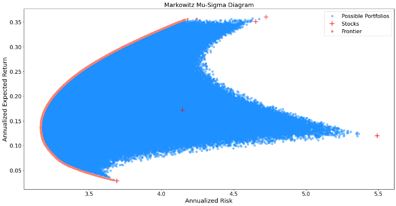
After depicting the frontier portfolios, it is to be noted that not all of those carry importance to an investor. This is because we find portfolio which have for a given risk level two levels of return. Given that we, as an investor are interested to obtain the maximum return given every risk level, only one out of two portfolios is therefore of interest to us.
Put differently, we are only interested in efficient portfolio. Efficiency is denoted here as having the highest return for every given risk level, or the lowest risk for every given return level.
When cutting off the inefficient portfolios from the frontier line, we end up with something called the efficient frontier.
Another portfolio of interest is the Minimum Variance Portfolio (MVP) which denotes the portfolio which has the lowest variance possible, out of all portfolios.
The following code snippet implements the concepts of efficient frontier and MVP.
min_var = min(minimum_risk_given_return)
mvp_bool = min_var == minimum_risk_given_return
mvp_risk = np.array(minimum_risk_given_return)[mvp_bool]
mvp_return = np.array(given_return)[mvp_bool]
ef_bool = given_return >= mvp_return
ef_risk = np.array(minimum_risk_given_return)[ef_bool]
ef_return = np.array(given_return)[ef_bool]
fig, axs = plt.subplots(nrows=1, ncols=1, figsize=(20, 10))
axs.scatter(portfolio_std, portfolio_returns, color="dodgerblue", alpha=0.5,
            label="Possible Portfolios")
axs.scatter(np.sqrt(np.diag(covariance_matrix)), vector_returns, color="red",
            label="Stocks", marker="+", s=200)
axs.scatter(ef_risk, ef_return, color="springgreen",
            label="Efficient Frontier")
axs.scatter(mvp_risk, mvp_return, color="orange", marker="D",
            label="Minimum Variance Portfolio", s=400)
axs.tick_params(axis="both", labelsize=16)
axs.set_ylabel("Annualized Expected Return", fontsize=18)
axs.set_xlabel("Annualized Risk", fontsize=18)
axs.set_title("Markowitz Mu-Sigma Diagram", {"fontsize": 18})
axs.legend(fontsize=16)
axs.tick_params(axis="both", labelsize=16)
fig.savefig("{}/efficient_frontier.png".format(output_path),
            bbox_inches="tight")
The image above shows nicely the MVP as well as the efficient portfolios out of all frontier portfolios.
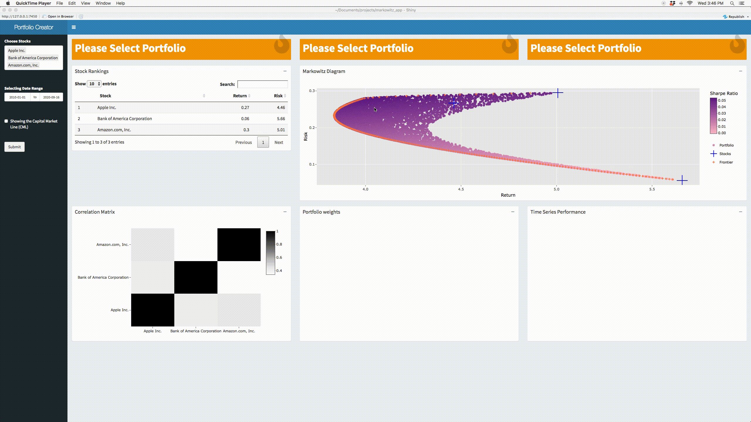
Multiple Asset R Shiny App
Last but not least, we put all of our findings in one application which can be accessed here:
This app is a hybrid between Python and R. Python was used to calculate all portfolio information, whereas R Shiny was used to build the web-application. Finally, the app was deployed using shinyapps.io. All code is put on github and can be accessed here.