
DengAI: Predicting Disease Spread — STL Forecasting/ ARIMA/ Box-Jenkins
Using the STL Forecasting Method with an ARIMA model, which is parameterized through the Box-Jenkins Method.
This post builds on our first blogpost which dealt with the initial data-transformation of the exogenous variables. Now we build a first model using only target variable itself. This is done by using the STL Forecasting method. This allows us to model time series which are affected by seasonal effects, by first removing the specified seasonality through a STL decomposition and then modeling the deseasonalized time series with a model of our choice — which is an Autoregressive Integrated Moving Average Model (ARIMA).
For those not familiar with the forecasting challenge, this competition deals with the prediction of dengue fever in two cities, or in the words from DrivenData themselves:
Your goal is to predict the total_cases label for each (city, year, weekofyear) in the test set. There are two cities, San Juan and Iquitos, with test data for each city spanning 5 and 3 years respectively. You will make one submission that contains predictions for both cities.
In order for better readability, this blogpost only shows and discusses graphs from the city San Juan. Further, the related code for every graph is found directly below each graph. Additionally the entire code (for both cities) is found at the bottom of this blogpost, or on GitHub.
In the center of our prediction approach is the aforementioned so-called STL method. STL stands for Seasonal-Trend decomposition method using LOESS. This method decomposes a time series into three components, namely its trend, its seasonality and its residuals. LOESS stands for locally estimated scatterplot smoothing and is extracting smooth estimates of the three aforementioned components.
Structural Changes
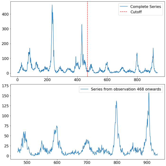
Looking at the time series of dengue fever in San Juan, several things are worth pointing out. For once there is a strong seasonal component visible. In the first half of the data it looks like the seasonal pattern is yearly (52 weeks), whereas in the second half of the time series the pattern somewhat switched to a two-yearly pattern. The other predominant characteristic of the time series are the few but stark spikes. Especially in the first half of the time series we see two outbursts in the target variable of a magnitude which is unparalleled in the second half.
def plot_cutoff_comparison(time_series, cutoff, city_name):

    first_half = time_series[:cutoff]
    first_half.name = "First Half"
    second_half = time_series[cutoff:]
    second_half.name = "Second Half"
    fig, axs = plt.subplots(nrows=2, ncols=1, figsize=(10, 10))
    axs[0].plot(time_series, label="Complete Series")
    axs[0].axvline(cutoff, color="r", linestyle="--", label="Cutoff")
    axs[1].plot(second_half,
                label="Series from observation {} onwards".format(cutoff))
    axs = axs.ravel()
    for axes in axs.ravel():
        axes.legend(prop={"size": 16}, loc="upper right")
        axes.tick_params(axis="both", labelsize=16)
    fig.tight_layout()
    fig.savefig(r"{}/{}/{}_cutoff_plot.png".format(output_path,
                                                   approach_method,
                                                   city_name),
                bbox_inches="tight")
    return first_half, second_half
At this point it is important to stress the higher importance of newer data compared to older data within time series problems. Normally within data science projects, we are very always interested in gathering more data, as this would in general increase the robustness and accuracy of our model. Though, when it comes to time series data, we have to weight the importance of new data on when exactly the data was sampled. If we are for example interested in predicting the stock price for a certain company, the company’s financial statements of the last couple of years, are undoubtely more important than the company’s performance 100 years ago. Why is that so? Because it could be possible that underlying data generating process changed over time. That would imply that older data is not giving us any information about future data and is therefore not only incorrect, but could also hurt our model performance.
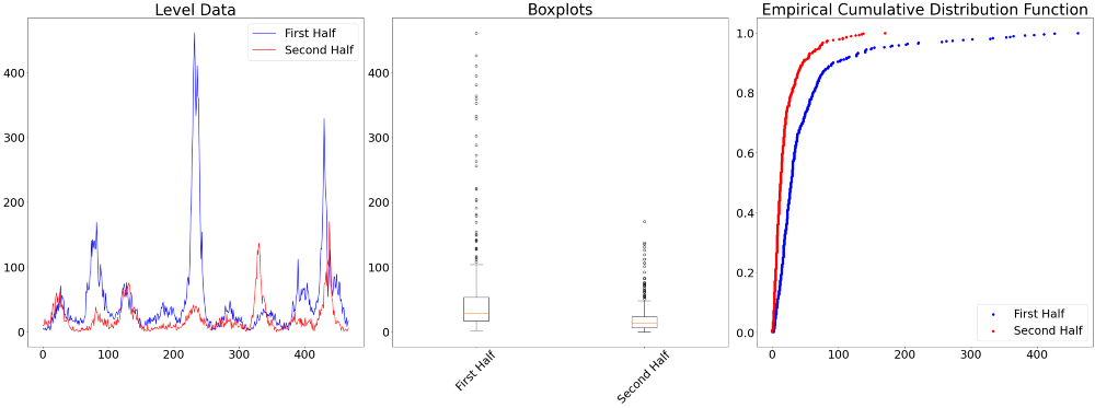
The three charts below visualize the differences between the first and second half of the time series.
def difference_in_distribution(series1, series2, city_name):

    # CDF
    def ecdf(data):
        """ Compute ECDF """
        x = np.sort(data)
        n = x.size
        y = np.arange(1, n+1) / n
        return x, y

    test_results = pd.DataFrame(index=["KS 2 Sample Test", "ANOVA"],
                                columns=["Statistic", "P Value"])
    test_results.iloc[0, :] = st.ks_2samp(series1, series2)
    test_results.iloc[1, :] = st.f_oneway(series1, series2)

    fig, axs = plt.subplots(ncols=3, figsize=(40, 15))

    # Time series
    axs[0].plot(np.arange(len(series1)), series1, color="b",
                label=series1.name)
    axs[0].plot(np.arange(len(series2)), series2, color="r",
                label=series2.name)
    axs[0].set_title("Level Data", fontsize=40)
    axs[0].legend(prop={"size": 30})

    # Boxplots
    axs[1].boxplot([series1, series2])
    axs[1].set_title("Boxplots", fontsize=40)
    axs[1].set_xticklabels([series1.name, series2.name],
                           fontsize=30,
                           rotation=45)

    x, y = ecdf(series1)
    axs[2].scatter(x, y, color="b", label=series1.name)
    x, y = ecdf(series2)
    axs[2].set_title("Empirical Cumulative Distribution Function",
                     fontsize=40)
    axs[2].scatter(x, y, color="r", label=series2.name)
    axs[2].legend(prop={"size": 30})

    for ax in axs.ravel():
        ax.tick_params(axis="both", labelsize=30)

    fig.tight_layout()
    fig.savefig(r"{}/{}/{}_cutoff_plot.png".format(output_path,
                                                   approach_method,
                                                   city_name),
                bbox_inches="tight")

    return test_results
Next to individual visual judgement, there are also several tests to formally check whether the distribution of the data is different, namely the Chow Test, the Kolmogrov Smirnov 2-Sample test, and an Analysis of Variance (ANOVA). For the latter two we find the test results between the first half and the second half of the data below.
The significance test results confirm our initial hypothesis of a structural difference in the data generating process between the first and second half of the data.
Though it is important to note that only because the data is found to be different, we do not necessarily have to discard all observations from the first half. Instead we will winsorize and use the seasonality found in the second half of the data.
Winsorizing
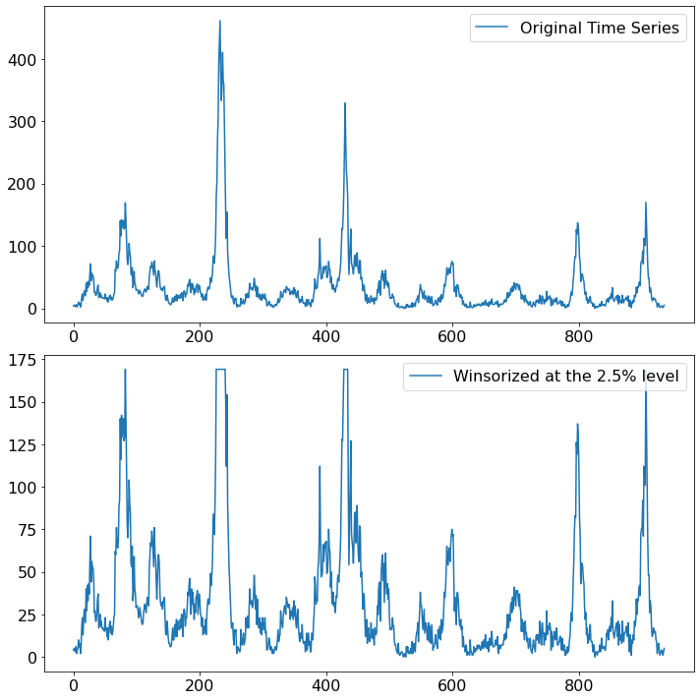
Winsorizing presents a valid alternative compared to simply dropping the data. This method is used when instead of throwing out potential outliers, we would like to keep them but alter their magnitude. This is done by specifying by much a potential outlier should be adjusted. A winsorizing value of X% for example means that all values which are higher than the (100-X) percentile are set to the value of the (100-X) percentile. A more thorough explanation of the process can be found here.
The chart below shows the impact of winsorizing our data to the 2.5% level (a value that is chosen to equalize the outbursts in the first half of the data). When looking at the scale of the y-axis the effect of the measure becomes apparent, the magnitude of the outliers has dampened.
def winsorizer(time_series, level, city_name):

    decimal_level = level / 100
    wind_series = st.mstats.winsorize(time_series, limits=[0, decimal_level])
    fig, axs = plt.subplots(nrows=2, ncols=1, figsize=(10, 10))
    axs[0].plot(time_series, label="Original Time Series")
    axs[1].plot(wind_series,
                label="Winsorized at the {}% level".format(level))
    axs = axs.ravel()
    for axes in axs.ravel():
        axes.legend(prop={"size": 16}, loc="upper right")
        axes.tick_params(axis="both", labelsize=16)
    fig.tight_layout()
    fig.savefig(r"{}/{}/{}_win.png".format(output_path,
                                           approach_method,
                                           city_name),
                bbox_inches="tight")
    return wind_series
Of course this does measure does not come without any risks. Winsorizing, or outlier altering in general, implies that we do not expect to see levels as high as the altered values. Given that the second half of the time series, which spans eight years of data, does not exhibit outbursts in any comparable magnitude, we feel confident to proceed with the winsorization.
Seasonality Detection
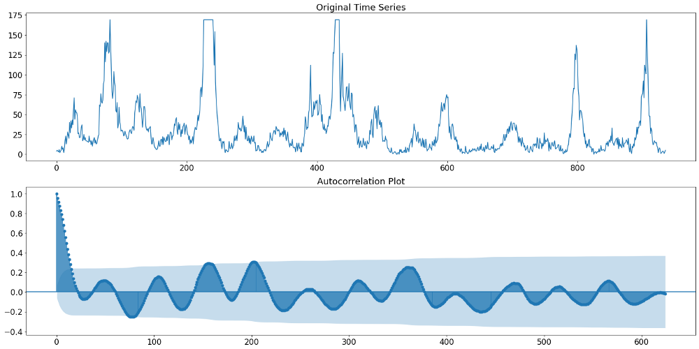
When using a STL decomposition, we need to specify which periodicity the seasonality is supposed to have. In order to find that out, we can either specify an appropriate time index and let the frequency be inferred automatically, or we can look at the autocorrelation function (ACF) of the time series. The ACF shows us the correlation between time series observations and observations with various lagged version of the very same time series. A high autocorrelation with the first lag would for example describe a process where the value today is very much alike the value yesterday. Following the same logic, it is also possible to spot a potential seasonality in the data. Namely, by finding a timely reoccurring amplitude in the ACF of a time series.
Below we can see in the upper plot the actual target variable, namely the number of Dengue Fever cases in San Juan. The plot underneath shows the discussed autocorrelation function of that time series. The ACF plot indicates that initially (up until lag 400) we find a yearly pattern. That means that the amplitude is occurring at multiple of 52 (52 weeks equal a year). Beyond lag 400 we find a different pattern though. Something that resembles rather a two-year seasonality. Given the aforementioned higher importance of more recent data, we will therefore continue with a 104 week (or 2 year) seasonality.
def acf_plots(y, max_lags, city_name):
    fig, axs = plt.subplots(nrows=2, figsize=(20, 10))
    sm.graphics.tsa.plot_acf(y.values.squeeze(),
                             lags=max_lags, ax=axs[1], missing="drop")
    axs[1].set_title("Autocorrelation Plot", fontsize=18)
    axs[0].set_title("Original Time Series", fontsize=18)
    axs[0].plot(y)
    for ax in axs.ravel():
        ax.tick_params(axis="both", labelsize=16)
    fig.tight_layout()
    fig.savefig(r"{}/{}/{}_raw_acf.png".format(output_path, # Individual output path
                                               approach_method, # Individual folder
                                               city_name),
                bbox_inches="tight")
Autoregressive Integrated Moving Average Model
Next in line is the parameterization of the ARIMA model. For that we have to remember that the STL Forecasting function is applying the prediction model on the deasonalized time series data, and not on the raw data. We therefore have to deseasonalize our data before examining it. This is by using the STL decomposition, specifying aforementioned 14 as our period.
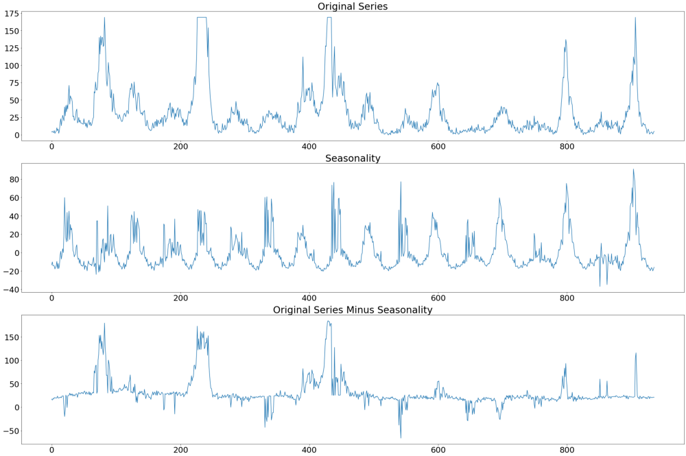
In the image below we can see the original series at the very top, followed by the seasonality and the difference between the original series and the seasonality. It is the latter time series we will use to identify the appropriate paramerterization of the ARIMA model.
def stl_decomposing(y, period, city_name):
    time_series = y.copy()
    res = STL(time_series, period=period, robust=True).fit()
    fig, axs = plt.subplots(3, 1, figsize=(30, 20))
    time_series.plot(ax=axs[0], label="Original Series")
    time_series_wo_season = time_series - res.seasonal
    res.seasonal.plot(ax=axs[1])
    time_series_wo_season.plot(ax=axs[2])
    axs[0].set_title("Original Series", fontsize=30)
    axs[1].set_title("Seasonality", fontsize=30)
    axs[2].set_title("Original Series Minus Seasonality", fontsize=30)
    for ax in axs.ravel():
        ax.tick_params(axis="both", labelsize=25)
    fig.tight_layout()
    fig.savefig(r"{}/{}/{}_decomposed_acf.png".format(output_path,
                                                      approach_method,
                                                      city_name),
                bbox_inches="tight")

    return time_series_wo_season
Given that the deasonalized time series does not suffer from any kind of non-stationarity, we do not have to worry about the number of integration within the ARIMA model, since none is necessary. The bigger question is how many autoregressive (AR) and moving averages (MA) lags are necessary. In practice the lag length of the AR and MA processes are denoted by the letter p and q respectively.
One well-known approach for specifying the optimal lag length of AR and MA processes is the so-called Box-Jenkins method. This method involves three steps:
- After ensuring stationarity, use plots of the autocorrelation function (ACF) and the partial autocorrelation function (PACF) to make an initial guess of the lag length for the AR and MA process
- Use the parameters gauged from the first step and specify a model
- Lastly check the residuals of the fitted model for serial correlation (independence of each other) and for stationarity. The former can be achieved using a Ljung-Box test. If the specified model fails these tests, go back to step 2 and use slightly different parameter for p and/or q
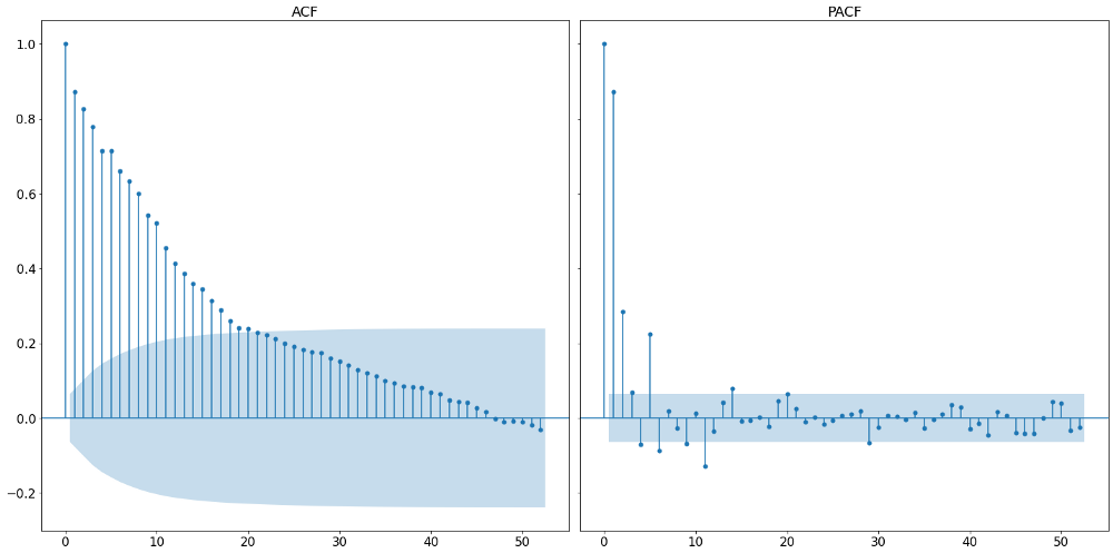
Following the three steps outlined above, we start by plotting the autocorrelation function and the partial autocorrelation function. These can be seen in the graph below.
A partial autocorrelation is the amount of correlation between a variable and a lag of itself that is not explained by correlations at all lower-order-lags. That is done by regressing the time series with all n-1 lags and therefore controlling for them when assesing the n-th partial correlation. It contrasts with the autocorrelation function, which does not control for other lags.
def acf_pacf_plots(time_series, nlags, city_name):

    # Plotting results
    no_nan_time_series = time_series.dropna()
    fig, axs = plt.subplots(nrows=1, ncols=2, figsize=(20, 10), sharey=True)
    sm.graphics.tsa.plot_acf(no_nan_time_series,
                             lags=nlags, fft=True, ax=axs[0])
    sm.graphics.tsa.plot_pacf(no_nan_time_series,
                              lags=nlags, ax=axs[1])
    for ax, title in zip(axs.ravel(), ["ACF", "PACF"]):
        ax.tick_params(axis="both", labelsize=16)
        ax.set_title(title, fontsize=18)
        ax.set_title(title, fontsize=18)
    fig.tight_layout()
    fig.savefig(r"{}/{}/{}_acf_pacf.png".format(output_path,
                                                approach_method,
                                                city_name),
                bbox_inches="tight")
The way of how to identify the appropriate lag length from the two plots above is summarized in the following table:
From that we can see that the appropriate lag length of the AR process is the number of initial non-zero lags in the partial autocorrelation function. Looking at the plot above, we can see that this should be around 6, given that the seventh lag lies within the boundaries of the 95% confidence interval and is therefore not significant. It is to be noted that the very first vertical line represent the partial autocorrelation with itself and should be not counted.
The number of MA processes is taken by counting the number of initial non-zero terms within the autocorrelation function. In our example, we find rather many, namely around 20. It is important to note that the exact number is not too important as will empirically check a multitude of models before deciding for one.
It is important to stress that the Box-Jenkins method builds on the parsimony principal. Quoting the Oxford econometrician Kevin Sheppard:
Parsimony is a property of a model where the specification with the fewest parameters capable of capturing the dynamics of a time series is preferred to other representations equally capable of capturing the same dynamics.
That means that if we find multiple models which meet our conditions regarding serial correlation, we will choose the model with the smallest amount of lags. Therefore we check the results of the Ljung-Box serial correlation test not only for the lag lengths 6 and 20 (which is already way too many), but for all smaller lengths as well. The p-values of the Ljung-Box tests are captured in the image below.
It is visible that nearly all model parameterization find a significant Ljung-Box test, signaling serious serial correlation. Luckily, we also find some model parameterizations with non-significant serial correlation within the residuals. Applying the parsimony principle leads us then to take the AR-2 MA-2 model.
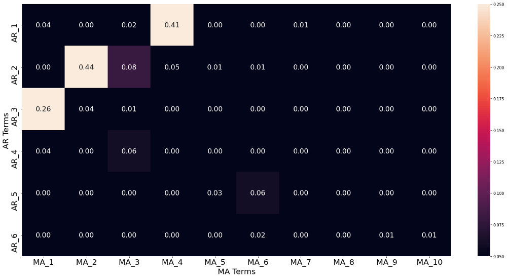
def box_jenkins_lb_finder(y, p, q, year_in_weeks, city_name):
    lb_df = pd.DataFrame(columns=["MA_{}".format(x) for x in range(1, q)],
                         index=["AR_{}".format(x) for x in range(1, p)])
    for i in range(1, p+1):
        for j in range(1, q+1):
            stlf = STLForecast(y, ARIMA, period=year_in_weeks, robust=True,
                               model_kwargs=dict(order=(i, 0, j), trend="c"))
            stlf_res = stlf.fit()
            results_as_html = stlf_res.summary().tables[2].as_html()
            results_df = pd.read_html(results_as_html, index_col=0)[0]
            lb_df.loc["AR_{}".format(i),
                      "MA_{}".format(j)] = results_df.iloc[0, 0]

    # Create heatmaps out of all dataframes
    fig, axs = plt.subplots(figsize=(20, 10))
    sns.heatmap(lb_df.astype(float), annot=True, fmt=".2f",
                ax=axs, annot_kws={"size": 18},
                vmin=np.min(lb_df.values),
                vmax=np.percentile(lb_df.values, 25))
    axs.set_xlabel("MA Terms", fontsize=20)
    axs.set_ylabel("AR Terms", fontsize=20)
    axs.tick_params(axis="both", labelsize=20)
    fig.tight_layout()
    fig.savefig(r"{}/{}/{}_lb_comp.png".format(output_path, approach_method,
                                               city_name),
                bbox_inches="tight")
In-Sample Check and Forecasting
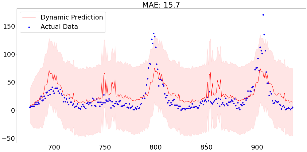
Finally it is time to look at some predictions from our model. It is important to note that in this forecasting challenge we are not interested in one-step ahead predictions, but a 260-step ahead forecast. In order to validate our performance we therefore need to specify a dynamic prediction method. That means that the model does not treat prior values as realized from a defined point onward, but is aware that these are predictions themselves.The graph below shows predictions of 260 values with the aforementioned dynamic forecasting method. The mean absolute error of 15.7 still represents an in-sample value and can therefore not be taken as representative for out-of-sample performance.
After applying the same steps for the other city in our data, we can then hand in our prediction results. From the picture below we can see that our predictions are far away from being competitive. Though, it has to be said that this performance, which is more or less equally good compared to the benchmark model provided by DrivenData, did not make use of any exogenous variable, meaning that there is still a lot improvement potential.