
How the People Really Voted
Why geographically correct maps show elections results inaccurately
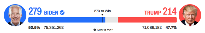
The presidential election of 2020 was said by many to be the most important election ever held. The voting turnout was higher than ever before, and the arguably most controversial president in history, Donald Trump, lost to his democratic opponent Joe Biden.
The unprecedented amount of mail-in ballots took its toll on the patience of the nation and the world. On election day, the 3rd of November, it was anything but clear who won the election. The polls before election turned out not to be very representative of true sentiments, a similar flaw as was seen in 2016. Donald Trump’s performance and his backing were grossly underestimated.
On Saturday the 7th of November, the United States of America finally had a new president-elect, assuming of course that the Trump campaign is not able to successfully prove voter fraud in multiple states; a claim which at this point in time seems unfounded and not backed by hard evidence.
Throughout the long wait before the announcement of the president-elect, all major news sources showed a map of the United States in which every states was colored either in blue for the Democrats or red for the Republicans. This blogpost elaborates on why this map is a misleading representation of the relative importance of each state in determining who wins the presidency, and might convey the wrong feeling as to which candidate had the strength of numbers behind him in this election.
The problems of the actual map
The question might arise why in the United States each state is colored in the first place. The reason for that the different states are coloured in the first place is because of the Electoral College, which is a group of presidential electors whose sole purpose it is to elect the president. Every state is assigned a certain number of electors proportional to their population. Therefore, whichever candidate gets the majority within a state, gets all electors from one state (with the exception of Nebraska and Maine, where electors can be split between different candidates).
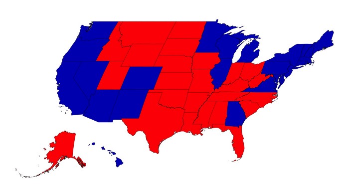
Below we can see the map of the United States already coloured by the party which won in the 2020 election. Even though the map is geographically correct, the large amount of red might convey the feeling that the Republican party was the predominant force. Considering the system of the electoral college, which was briefly discussed above, tells us that the number of electoral votes and not the size of the state is the decisive factor.
In order to give a better feeling how the people voted, or which state’s decision carried bigger importance, a geographically correct map is not the right tool to use. A significantly better method would be to use a cartogram.
What is a Cartogram
During the long period of waiting for results, all major news-sources used a country map of the United States, with states colored either in blue, red, or grey to indicate whether a state was called for the Democratic Party, the Republican Party or was not called yet, respectively. This map, despite being geographically accurate, does not really reflect the vote of the people.
That is because in the US there are many small states with a relatively large population, like New York or Massachussets. At the same time we also have large states which are home to only a few residents like Wyoming or North Dakota. All of this information remains hidden when looking on the map of the United States.
In order to give a better idea of how the people of the United States really voted in this election, the better choice would be to use a cartogram. A cartogram is a visualization based on maps, where features of the map like land mass size are distorted based on values of a variable.
To better explain the workings of such a map, we use the example from the R Graph gallery. Herein, the countries within the African continent are distorted based on their respective population size. Since Nigeria has the largest population of any country in Africa, it appears much larger than normal, as does Egypt. Other countries like Libya with very small populations appear smaller than their normal size.
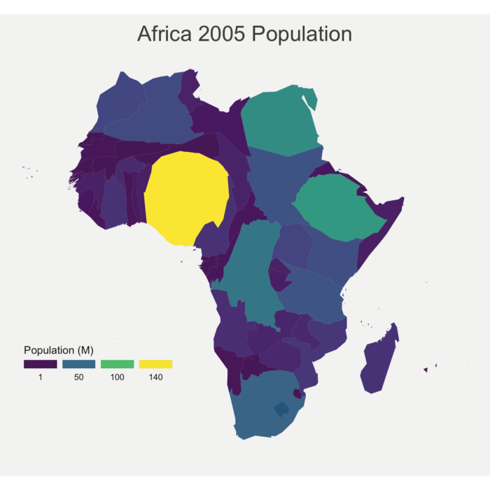
Looking at this map gives us a much better idea of the relative population by country. The same concept is now applied to better visualize how the people in each state voted.
A cartogram for the United States election
When applying the methodology of the cartograms outlined above now to the map of the United States we get the following image.
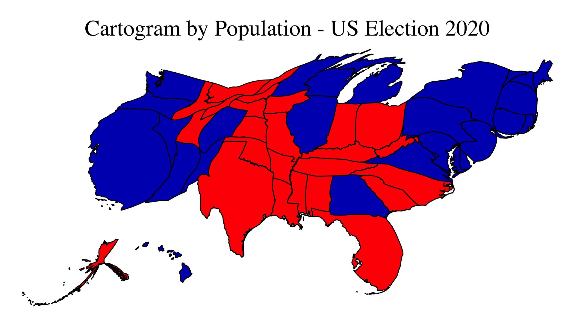
Even the map looks very different from the geographically correct map we are accustomed to seeing, it is still possible to identify the states. Especially remarkable are the changes in size of the states on the East and West Coasts. California, an already larger state, has here more than doubled in size. This result may have been expected for those who know that California is home to about 40 million Americans. Even more drastic are the changes in the East Coast states, where relatively small states like New Jersey and Massachusetts now represent one of the biggest states there are in the US.
The cartogram above results in a graphical representation of the United States as we have not seen it before
Using electoral votes instead of actual population
It is important to note though that because of the electoral college, the cartogram which is based on the actual population by state might not be the optimal visualization to use. That is because electoral college delegates are not only distributed amongst the states entirely based on how many people live in each state — even the states with the smallest populations still get the same minimum number of 3 electors. This means that they receive relatively more electors per person in their state than states with larger populations.
The cartogram below shows, in contrast to the cartograms before, how the cartogram would look like if not the population but the number of electoral votes is used to determine the distortion of each state. We can see that states like California and basically the entire east coast still looks much bigger than the original map, even though the distortion magnitude decreased.
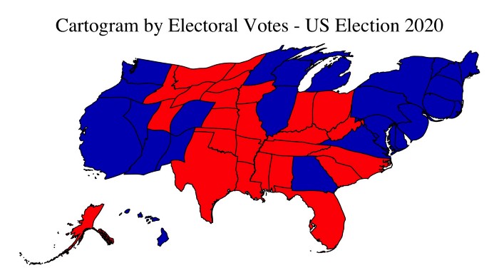
Whether it be by population, or by electoral votes, when looking at the colored map of the United States during election time, it is important to note that a purely geographical representation underestimates the importance of high-population, small-land-mass states.
The electoral system of the United States is drastically different to that of other countries. Therefore, a simple glance at a geographically correct map should always be taken with a grain of salt. To see the truth, one has to dig a bit deeper.