Classifier Evaluation Methods - A Hands-On Explanation
Accuracy/ Recall/ Precision/ Confusion Matrix/ ROC Curve/ AUC
In pretty much 50% of all Data Science interviews around the world, the interviewee is asked to build and assess a binary classification model. This means classifying a certain observation to be either positive (normally denoted as the number 1) or negative (denoted as 0), given a bunch of features. A common mistake that interviewees make is to spend too much time building and tuning an overly-sophisticated model and not enough time elaborating on which classification evaluation metric is appropriate for the problem. That habit is even enforced through Kaggle, or Kaggle-like Data Challenges, in which the classifier evaluation metric is not carefully chosen by the participant, but is already set by the host.
This blogpost will therefore shed more light on the different classification evaluation methods commonly used, how they are derived, when to use them, and, arguably most importantly, how to implement them in Python.
The toy dataset we use for this post is obtained from the DrivenData challenge called: Richter’s Predictor: Modeling Earthquake Damage. WE are already familiar with the dataset for this project, given that we participated in this challenge which can be read up on here. As the name of the project suggests, this challenge involves predicting earthquake damages, specifically damage from the Gorkha earthquake which occurred in April 2015 and killed over 9,000 people. It represents the worst natural disaster to strike Nepal since the 1934 Nepal-Bihar earthquake.
The prediction task for this project is to forecast how badly an individual house is damaged, given the information about its location, secondary usage, and the materials used to build the house in the first place. The damage grade of each house is stated as an integer variable between one and three.
Preliminaries/ Importing the data/ Feature engineering
We begin by importing the relevant packages and setting all the path variables in order to better access the data. Afterwards we import the features and the label which can be downloaded from the DrivenData website. All of that is done by the following lines of code.
# Packages
import pandas as pd
import numpy as np
import pickle
import matplotlib.pyplot as plt
import seaborn as sns
from tqdm import tqdm

from sklearn.model_selection import train_test_split
from sklearn.linear_model import LogisticRegression, SGDClassifier
from sklearn.ensemble import GradientBoostingClassifier
from sklearn.metrics import (accuracy_score,
                             confusion_matrix,
                             plot_confusion_matrix,
                             recall_score,
                             precision_score,
                             auc, roc_curve)

# Paths
MAIN_PATH = r"/Users/paulmora/Documents/projects/roc_curve"
RAW_PATH = r"{}/00 Raw".format(MAIN_PATH)
CODE_PATH = r"{}/01 Code".format(MAIN_PATH)
DATA_PATH = r"{}/02 Data".format(MAIN_PATH)
OUTPUT_PATH = r"{}/03 Output".format(MAIN_PATH)

# Loading the data
total_labels = pd.read_csv(r"{}/train_labels.csv".format(RAW_PATH))
total_values = pd.read_csv(r"{}/train_values.csv".format(RAW_PATH))
In contrast to an usual data challenge, we do not need to import any test values, since this blogpost is elaborating on the evaluation of classification model and not on the classification model itself. Next up is some initial data cleaning and feature engineering. Given that we are not interested in this post in explaining optimizing the actual model-performance, we will keep the data-processing work to a minimum.
total_values.info()
The above mentioned line of code shows us what kind of work needs to be done, as it is showing us all column names and the information what datatype the information is stored as.
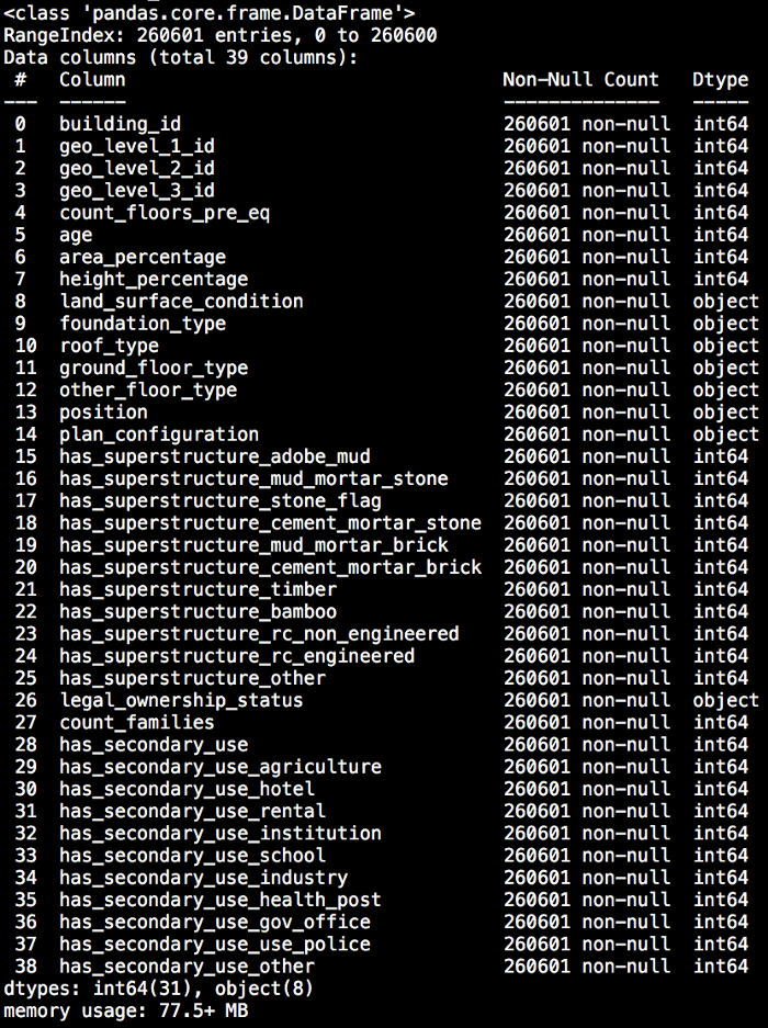
We can see that most variables are already specified in integer-form and therefore do not need any form of altering. The exception of that rule is the column building_id which is an identifier of the particular building and represent non-informative information and can therefore be dropped.
All columns which are represented as a categorical variable (dtype: “object”) will be transformed to dummy variables via one-hot-encoding. This could potentially result in a dangerously sparse dataset, but again, the model performance is not our focus.
It is now time to briefly look at the target variable before merging it with the features and to build our classification models. For that we consider the following line of code as well as the result given beneath it.
total_labels.loc[:, "damage_grade"].value_counts()

Given that we would like to focus on binary classification, we see from the output above that some changes in the target variable are necessary since we see that we have more than two outcomes. We therefore drop the damage category 3 from the data. Afterwards we subtract 1 from the target variable in order to create a target variable which is either 0 or 1. This step will also alter the meaning of the problem. Whereas before the target variable was telling us how badly a house was damaged, now the target variable can be regarded as an indication whether a house experienced high damage or whether it did not.
The following lines of code handle the feature engineering and the altering of the target variable. Furthermore, we create a countplot using the seaborn visualization package in order to see the balance of the target variable.
total_df = pd.concat([total_labels, total_values], axis=1)
not_3_bool = total_df.loc[:, "damage_grade"] != 3
subset_df = total_df.loc[not_3_bool, :]
subset_df.loc[:, "damage_grade"] = subset_df.loc[:, "damage_grade"] - 1
subset_df.rename(columns={"damage_grade": "high_damage"}, inplace=True)
subset_df.drop(columns=["building_id"], inplace=True)
subset_dummy_df = pd.get_dummies(subset_df)

plt.rcParams.update({"font.size": 20})
fig, axs = plt.subplots(figsize=(10, 10))
sns.countplot(subset_df.loc[:, "high_damage"], ax=axs)
axs.tick_params(axis="both", which="major")
axs.set_xlabel("High Grade")
axs.set_ylabel("Count")
path = (r"{}/int.png".format(OUTPUT_PATH))
fig.savefig(path, bbox_inches='tight')
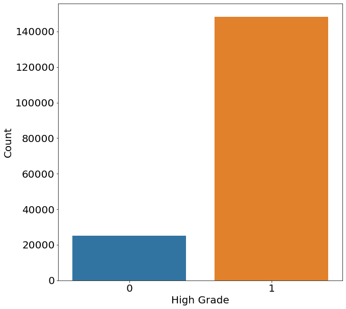
From the chart above we can see that the majority of cases show a highly damaged house and that the data is therefore imbalanced. An imbalanced dataset describes a situation where we have a significantly inequality in the number of appearances of one or multiple classes with the target variable. For the moment we will leave this imbalance as it is, but remember it for later when talking about the model performance.
Model Training
The three models chosen for our prediction model are a Logistic Regression, Gradient Boosting Classifier and Stochastic Gradient Descent Classifier. There is no particular reason to choose these three models and any other would do as well.
We then split the data into train and test in order to avoid data-leakage which would result in artificial superior performance of the model given that it was trained partly with test data. Afterwards the three models are initiated and a random state is set in order to be able to reproduce our results later. The following lines code cover the aforementioned as well as fit the three models on the data.
train, test = train_test_split(subset_dummy_df, test_size=0.3,
                               random_state=28, shuffle=False)
train.to_pickle("{}/train.pickle".format(DATA_PATH))
test.to_pickle("{}/test.pickle".format(DATA_PATH))

X_train = train.drop(columns="high_damage")
y_train = train.loc[:, "high_damage"]
X_test = test.drop(columns="high_damage")
y_test = test.loc[:, "high_damage"]

logreg = LogisticRegression(max_iter=1000, random_state=28)
logreg.fit(X_train, y_train)

gbt = GradientBoostingClassifier(random_state=28)
gbt.fit(X_train, y_train)

sgdreg = SGDClassifier(fit_intercept=True)
sgdreg.fit(X_train, y_train)
Confusion Matrix
So far we cleaned the data, created some basic features and trained three models. It is now time to finally create some predictions and evaluate these. In the case of a binary prediction we can end up with four different possibilities between the true label and our prediction, namely:
- The true value is 1 and the prediction is 1 (True Positive)
- The true value is 1 and the prediction is 0 (False Negative)
- The true value is 0 and the prediction is 1 (False Positive)
- The true value is 0 and the prediction is 0 (True Negative)
As it can be already seen from the description in brackets behind each case, there also exist a name for each of these cases. In order to have all of that information in one big picture, we look at something called the confusion matrix, which is implemented through the following code.
# Predictions
logreg_pred = logreg.predict(X_test)
gbt_pred = gbt.predict(X_test)
sgdreg_pred = sgdreg.predict(X_test)

# Confusion matrix
raw_conf_logreg = confusion_matrix(y_test, logreg_pred)
raw_conf_gbt = confusion_matrix(y_test, gbt_pred)
raw_conf_sgd = confusion_matrix(y_test, gbt_pred)

fig, axs = plt.subplots(ncols=3, figsize=(30, 10))
axs = axs.ravel()
for i, (title, model) in enumerate(zip(["Logistic Model",
                                        "GradientBoosting Model",
                                        "Stochastic Gradient Descent"],
                                       [logreg, gbt, sgdreg])):
    plot_confusion_matrix(model, X_test, y_test, ax=axs[i])
    axs[i].set_title(title, fontsize=24)
    axs[i].set_ylabel("True Label")
    axs[i].set_xlabel("Predicted Label")
path = (r"{}/confusion_matrices.png".format(OUTPUT_PATH))
fig.savefig(path, bbox_inches='tight')

The confusion matrices above tell us how many of each of the four aforementioned cases we have for each prediction model. In the upper left corner of each graph we see number of cases of True Negatives, i.e. where the true label and the predicted label is zero. The bottom right shows the True Positives, meaning all cases where the True and Predicted value is equal to one. The other two, False Positives (upper right) and False Negatives (bottom left) are misclassification of the model.
When comparing the Gradient Boosting’s and Logistic Model’s confusion matricies, we see that the number of True Positives and the number of True Negatives are higher for the Gradient Boosting Model. This finding makes it clear that the Gradient Boosting model is much better than the Logistic Regression Model.
Figuring out whether the Gradient Boosting or the Stochastic Gradient Descent Model is better, on the other hand, is not so straightforward. That is because the number of True Negatives might be lower for the Stochastic Gradient Descent Model, but it has a higher amount of True Positives when compared to the Gradient Boosting Model.
Through the confusion matrix we could tell that we always would prefer the Gradient Boosting model over the Logistic Model, but we cannot infer which model to use when comparing the Stochastic Gradient Descent Model against the Gradient Boosting Model. For that we need to know more about our underlying problem by looking at further evaluation methods.
The Flaws of using Accuracy
The most common evaluation method used for classification models is arguably the Accuracy score. This score tells us out how often we were right out of all predictions. Accuracy is a very intuitive approach, but it can result in misleading results on imbalanced datasets.

The misleading nature of accuracy as an evaluation method becomes evident when considering an example of a classification model which detects every second whether a house is on fire. We then consider a stupid classifier which always says the house is not on fire. Given that a house is most of the time not in a burning state, the classifier’s prediction will be correct basically all the time.
However, that one night when someone forgot to blow out the candle, the classification model will have False Negative errors — with deadly consequences. Fatal mistakes like this one are not reflected in the Accuracy score, given that in every moment where the house was not burning, it predicted the label correctly.
This great performance of this stupid classifier shows the danger of evaluating a model only by its Accuracy score, when the overall dataset is imbalanced or when we are more concerned with a certain type or errors.
Precision and Recall
Two other popular classification evaluation methods are called Precision and Recall. When to use which method depends on the use case and specifically to which error we are more prone to. To illustrate that, we consider two cases:
-
Breast Cancer Classification: Within this scenario, it is preferable to predict that a woman has breast cancer even though she does not have any (False Positive). That is because predicting the other way around (False Negative) would leave a woman in the believe she is safe when she is not.
-
Spam Mail Classification: Here, it would be okay for us if our spam detector classifies a fishy email as non-spam (False Negative), but it would be annoying to find out that an important business email/bill was hiding in the spam folder for the last two weeks because it was incorrectly classified as spam (False Positive).
The two cases above show us that the choice of the evaluation metric depends crucially on what is important to us. In the first case we are much more concerned about False Negatives, meaning that leaving a woman with cancer believing she is well is much worse than telling a woman to undergo further checks even if she does not have to. When the cost of of False Negatives are high, we use Recall, which has the following definition:

In the second example we are more concerned about False Positive errors, namely saying an email is spam even though it was a harmless email from your work. Not seeing this email is much more damaging to the user than seeing one additional spam email. When er are concerned about False Positives, we use Precision, which is defined the following way:

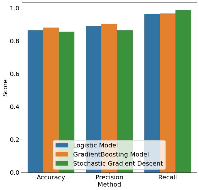
In our example, we are predicting whether a house is highly damaged. We furthermore assume that in the case the classifcation model says that the house is not damaged, the house-owner rents the house out to others. In this case we are much more concerned about False Negative errors. This is because a False Negative mistake would lead the house owner to believe that the house has low damage even though it is highly damaged, endangering the lives of the people living in it. In the case of a False Positive, the house owner would falsely think that the house is severly damaged and order reparations of the house when none are needed — aconsiderably better outcome compared to death. Below we can see the different values of all aforementioned evaluation methods for all three models plus the generating code. From the highest bar within the Recall category, we can see that for our purposes the Stochastic Gradient Boosting model is the model of choice.
True Positive Rate/ False Positive Rate Closely related to Precision and Recall is the concept of True Positive Rate (TPR) and False Positive Rate (FPR), which are defined in the following way:
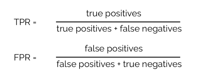
The observant reader might have the feeling that they have seen the formula for the TPR already. That potential feeling is correct, given that the True Positive Rate is a synonym for the Recall evaluation method we encountered before. Given that we already covered the concept of Recall/ TPR, we only elaborate on the intuition of the False Positive Rate.
Also known as the probability of False Alarm, the False Positive Rate is defined as the probability of rejecting a null-hypothesis which is in fact true. In the area of inferential statistics, this type of error is also referred to as a Type I error (in contrast to a Type II error which describes accepting a null-hypothesis when it is in fact incorrect).
Below we can see a matrix of how TPR and FPR fit in the bigger picture. It is obvious that in a perfect world we would like to have a high TPR but a low FPR. That is because we would like to classify everything that is positive as positive as well as nothing that is negative as positive.
eval_df = pd.DataFrame(columns=["Method", "Model", "Score"])

i = 0
for model, pred in zip(["Logistic Model",
                        "GradientBoosting Model",
                        "Stochastic Gradient Descent"],
                       [logreg_pred, gbt_pred, sgdreg_pred]):
    for meth, score in zip(["Accuracy", "Precision", "Recall"],
                           [accuracy_score, precision_score, recall_score]):

        eval_df.loc[i, "Method"] = meth
        eval_df.loc[i, "Model"] = model
        eval_df.loc[i, "Score"] = score(y_test, pred)
        i += 1

fig, axs = plt.subplots(figsize=(10, 10))
sns.barplot(x="Method", y="Score", hue="Model",
            data=eval_df, ax=axs)
axs.legend(loc="lower center")
path = (r"{}/acc_prec_rec.png".format(OUTPUT_PATH))
fig.savefig(path, bbox_inches='tight')
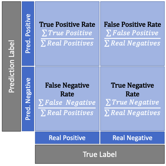
We also notice that there is some sort of trade-off between these two rates. Consider an example where we have seven true values and three negative values. If our algorithm classifies all ten as true we would get a TPR and FPR of 1. If on the other hand we classify all ten observations as false we would get a value of zero for both rates.
Thinking back to the example of spam-mails and breast cancer, we know that there are cases where we are prone towards False Positive mistakes than towards False Negatives. Combining that desire with the mentioned trade-off between TPR and FPR above leads us to the next topic: specific targeting for certain error types.
Targeting for Error Types
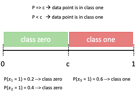
If we are particularly concerned about a certain error type, many classification models allow us to increase the sensitivity towards one or the other error. In order to explain how that works, it is important to note that probabilistic classification algorithms do not assign each observation directly to either 0 or 1, but rather tocalculate a probability with which an observation belongs to either class. The default rule is then if the probability that an observation belongs to class 1 is above 50%, then the observation is assigned to class 1. It is exactly this threshold value of 50%, which we will denote as c, that we will tweak.
If, for example, the probability of an observation belonging to class one is 60%, or 0.6, it is assigned to class one, since this is above the threshold of 0.5. This decision rule, even though simple, is also illustrated in the graphic below.
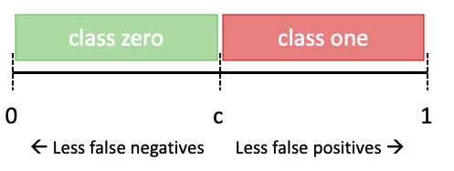
If we now tweak parameter c to be either higher or lower than 0.5, we would also alter the TPR and FPR.
This is easiest explained and understood when considering an example. Below we find the probability to belong to class one for five observation, as well as their true label. We can see that when the cutoff level is at its default level of 0.5. With that level of c, we find one False Negative and 0 False Positives.
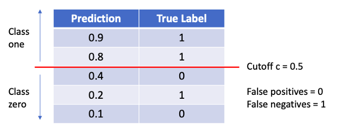
If we now alter the cutoff threshold to 0.2 we can see from the graphic below that we find one False Positive and zero False Negative.
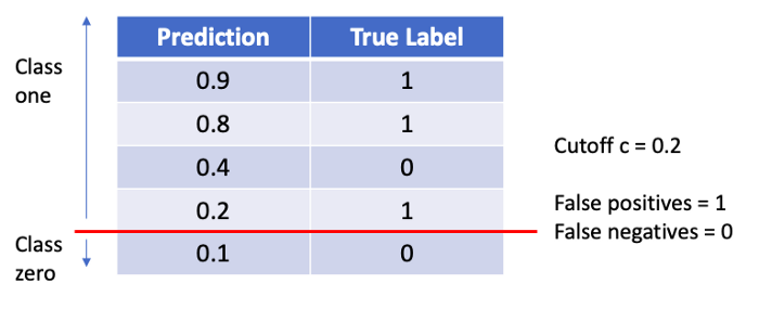
We notice: When changing the threshold value c, it is possible to obtain a different TPR and FPR, which therefore allows us to target for a certain error type.
Concept of ROC Curve and AUC
Now that we’ve seen how we can target and tweak our model towards a certain type of error through adjusting the parameter c, the question might arise how we would know what the optimal value of c is for our problem. This is where the Receiver Operating Characteristc (or short ROC curve) comes into play. The ROC curve plots all combinatins of TPR and FPR at every meaningful threshold level c, as shown in the GIF below.
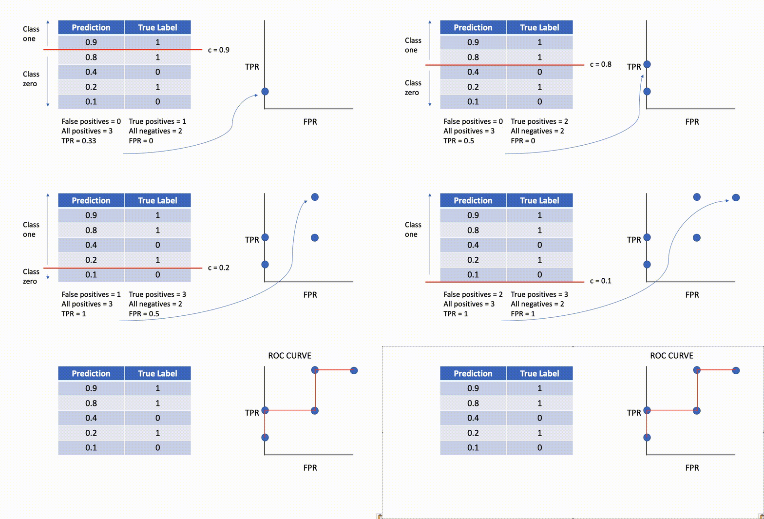
The off-the-shelf ROC curve implementation from sklearn does not take a random amount of different cutoffs, but loops over the probabilities of every observation for efficiency reasons. This will become clearer later when we implement the code for deriving the ROC curve ourselves.
Related to the concept of the ROC curve is the corresponding value under the curve, called simply area under the curve (or in short: AUC). This metric attempts to summarize the goodness-of-fit of the ROC curve in a single number. As the name implies, this is done by measuring the area under the ROC curve.
Given that the ideal curve hugs the upper lefthand corner as closely as possible — since that would mean that our classifier is able to identify all true positives while avoiding false positives — we know that the ideal model would have an AUC of 1. On the flipside, if your model was no better at predicting than a random guess, your TPR and FPR would increase in parallel to one another, corresponding with an AUC of 0.5.
When applying this concept to our house damage data, we note that not all classification methods provide the option to obtain a probability estimate. The Stochastic Gradient Descent (SGD) classification for example does not allow for probability score when using its default loss function (“hinge”). The reason for that is, that this loss function turns the SGD classifier into a Support Vector Machine, which is a non-probabilistic model.
The following code is therefore showing how to calculate and plot the ROC curve for the Gradient Boosting and Logistic Regression.
pred_proba_reg = logreg.predict_proba(X_test)
pred_proba_gbt = gbt.predict_proba(X_test)

fig, axs = plt.subplots(figsize=(10, 10))
for model, pred in zip(["Logistic Model",
                        "GradientBoosting Model"],
                       [pred_proba_reg,
                        pred_proba_gbt]):
    fpr, tpr, _ = roc_curve(y_test, pred[:, 1])
    auc_reg = auc(fpr, tpr)
    plt.plot(fpr, tpr, label="{} AUC:{:.2f}".format(model, auc_reg))
plt.legend()
axs.set_xlabel("False Positive Rate")
axs.set_ylabel("True Positive Rate")
path = (r"{}/automatic_auc_roc_curve.png".format(OUTPUT_PATH))
fig.savefig(path, bbox_inches='tight')
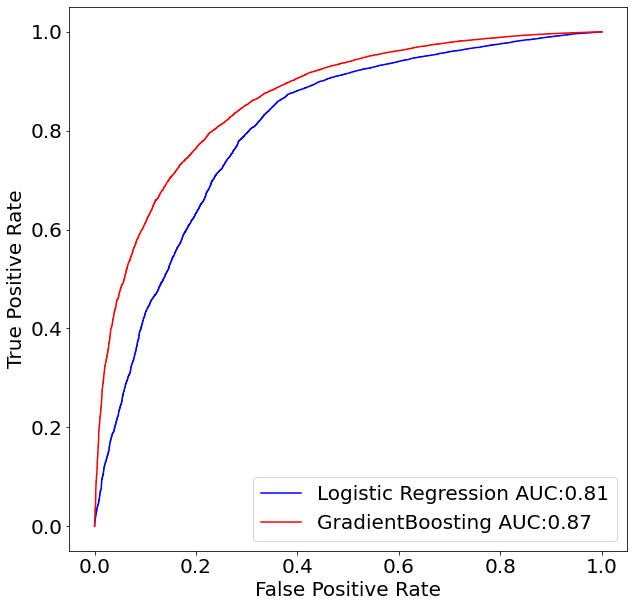
Given that we already know that the GradientBoosting model was superior to the Logistic Regression in terms of the number of True Positives and True Negatives, it was predictable that the GradientBoosting model will also dominate in the ROC curve space. This can be seen by noticing that the red line (GradientBoosting Model) is above the blue line (Logistic Regression) for every single threshold value c.
Manual Implementation of the ROC Curve
Lastly, it might be interesting to see how the ROC curve is implemented when doing it by hand. The code below does not intend to be the most efficient code for implement the ROC curve (the source code from sklearn is the place to look for that), but to be very easy to understand.
As can be seen in line 11, we sort the data-frame, which consists of the true labels and the probability that an observation is equal to one, by their probability value. This is done in order to afterwards loop over these probabilities and use them as the cutoff value. Afterwards, we simply have to count how many True Positive and False Positives we find for all observations which have a higher probability than the cutoff level c and divide them respectively by the total number of positives and negative labels.
def roc_manual(y_true, pred_prob):

    # Get the data ready
    pred_prob_series = pd.Series(pred_prob[:, 1])
    pred_prob_series.name = "pred"
    df = pd.DataFrame(pd.concat([y_true.reset_index(drop=True),
                                 pred_prob_series], axis=1))

    # Sorting probabilities in order to loop in an ascending manner
    sorted_df = df.sort_values(by="pred")

    # Calculate denominators
    true_num_pos = sum(y_true == 1)
    true_num_neg = sum(y_true == 0)

    # Create list container for results
    list_tpr, list_fpr = [], []

    for prob in tqdm(sorted_df.loc[:, "pred"]):

        # Create a boolean to mask only the values which qualify to be positive
        bool_classified_pos = sorted_df.loc[:, "pred"] > prob

        # Total number of positives and negative values
        tp = sum(sorted_df.loc[bool_classified_pos, "high_damage"] == 1)
        fp = sum(sorted_df.loc[bool_classified_pos, "high_damage"] == 0)

        # Calculate the TPR and FPR
        tpr = tp / true_num_pos
        fpr = fp / true_num_neg

        list_tpr.append(tpr)
        list_fpr.append(fpr)
    return list_tpr, list_fpr


gbt_list_tpr, gbt_list_fpr = roc_manual(y_test, pred_proba_gbt)
lgt_list_tpr, lgt_list_fpr = roc_manual(y_test, pred_proba_reg)

# Manual AUC and plotting
manual_auc_reg = abs(np.trapz(lgt_list_tpr, lgt_list_fpr))
manual_auc_gbt = abs(np.trapz(gbt_list_tpr, gbt_list_fpr))

fig, axs = plt.subplots(figsize=(10, 10))
plt.plot(lgt_list_fpr, lgt_list_tpr, color="orange",
         label="Logistic Regression AUC:{:.2f}".format(manual_auc_reg))
plt.plot(gbt_list_fpr, gbt_list_tpr, color="purple",
         label="GradientBoosting AUC:{:.2f}".format(manual_auc_gbt))
plt.legend()
axs.set_xlabel("False Positive Rate")
axs.set_ylabel("True Positive Rate")
path = (r"{}/manual_auc_roc_curve.png".format(OUTPUT_PATH))
fig.savefig(path, bbox_inches='tight')
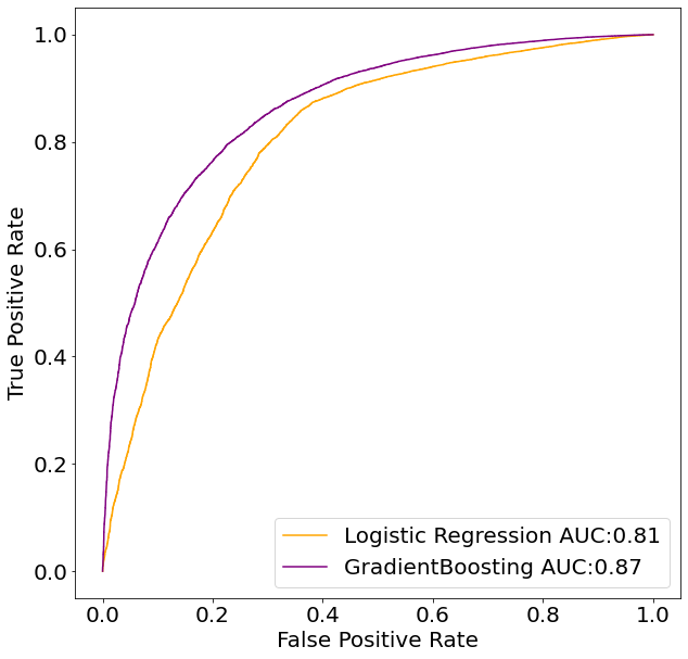
From the chart above we see that our manual implementation went correctly and that it perfectly matches the result of the sklearn-algorithm.
Summary
In this post, we’ve seen how the go-to evaluation metric for classificaiton models, accuracy, can fail to show goodness-of-fit for certain cases, such as cases of imbalanced classes. We then explored additional metrics that give more insight into model perfomance on imbalanced data, such as precision and recall. Finally, we dervied our own ROC curve and showed how it can be used to determine which model is best for the prediction task. These additional metrics extend your toolkit for understanding your models — helping you ultimately choose the right model for the job.
